Now forget about reading boring data, illustrating numerical or statistical data visually in your courses has never been easier with ActivePresenter 9. The very new feature – Chart – is here to help. Let’s learn how to create charts and graphs today.
Using charts and graphs makes it easy to interpret data, hence retaining viewers’ interest. In ActivePresenter 9, you can represent your data through symbols such as columns, lines, bars, and more.
Before exploring this feature, click the button below to download the latest version ActivePresenter 9:

4 following main parts will give you a detail on the way to make and manipulate charts:
Create Charts
To create a chart, follow these steps:
Step 1: Access the Insert tab > Chart.
Step 2: The Insert Chart dialog appears, letting you choose one out of 10 major chart types from the left pane.
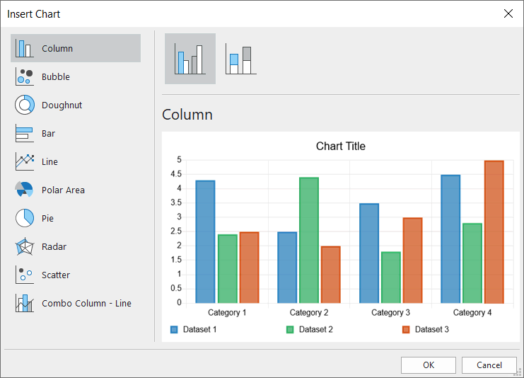
ActivePresenter 9 supports up to 10 major chart types with variations on each type for you to choose from. Just select and preview any available variations of each type at the top of the dialog.
Step 3: Click OK to insert.
Edit Chart Data
After inserting a chart, a window pops up, allowing you to edit the chart data. If you do not see the Chart Data window, make sure you click the chart to make it show up. Otherwise, you can right-click the chart group > select Edit Chart Data. Or go to the chart Properties pane > Chart > Styles > click the Edit Chart Data button.
Working with chart data is quite similar to working with cells in Excel spreadsheets. Do as follows:
- Select an individual cell and change or add content to it.
- Select one or more labels of columns/rows to manipulate multiple cells at once. Then, you can right-click them and choose the following options:
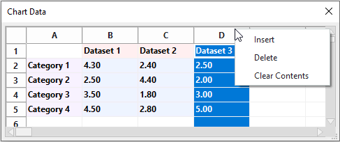
- Insert: Insert a new column/row to the left/above the selected column/row.
- Delete: Delete the selected column/row. Note that you can select multiple columns/rows and delete them at once.
- Clear Contents: Clear all cell content in the selected column/row. Alternatively, you can press the DELETE key on your keyboard.
After that, the chart will reflect all the changes you made immediately.
Customize Charts
There are several ways to modify and customize your charts and graphs. ActivePresenter 9 lets you change the chart size, adjust the chart container layout, show/hide elements on the chart, customize chart styles, and change the chart type.
Resize Charts
To resize a chart, you select a chart group and drag its resizing handles. Or, in the Properties pane > Size & Properties > Transform > enter specific values in the Width and Height spin boxes.
Adjust Chart Layout
An inserted chart group on the Canvas has 3 parts: the chart title (1), the chart area (2), and the chart legends (3).
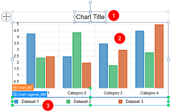
By default, the chart container has a flex layout. You can find its properties by selecting the chart group > Properties pane > Size & Properties > Container Layout.
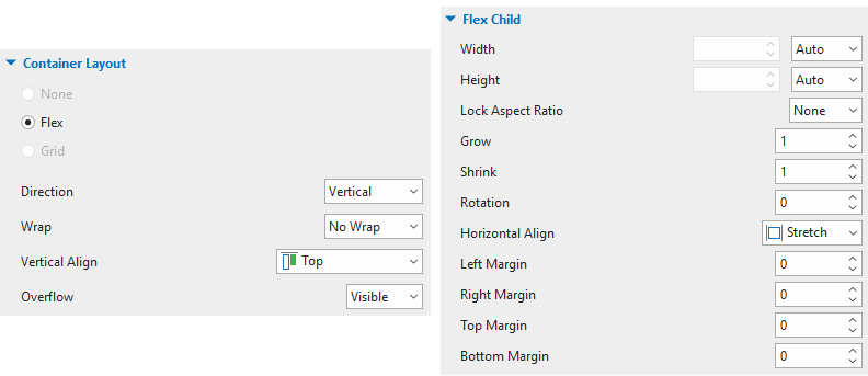
Chart parts in the flex container layout can be laid out and aligned automatically. You cannot manually adjust them. Instead, just select each chart part (flex child) and make changes in the Flex Child section.
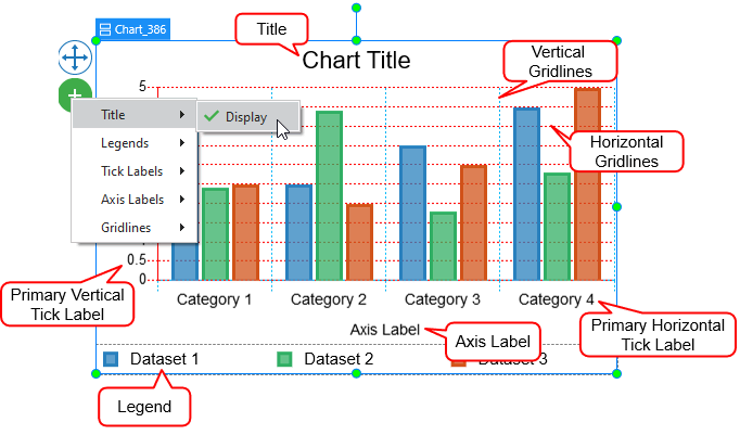
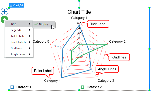
Show/Hide Chart Elements
Each chart contains several elements: Title, Legends, Tick Labels, Axis Label, and Grid Lines. For the Polar Area and Radar chart types, there are also the Point Label and Angle Lines elements.
You can show or hide these elements by selecting a chart group, clicking on the plus button, and selecting the options.
Customize Chart Styles
To change styles for a chart, you first select it > Properties pane > Chart > Style. You are free to customize styles of chart datasets, scale options, markers, interpolation lines, and so on. Chart style properties may vary from type to type. So, just refer to the tutorial of each chart type for more information.
Change Chart Types
To replace the existing chart type with another one, you select that chart first. Next, do either of the following:
- Open the Insert tab > Chart > choose another chart type.
- Right-click the existing chart group > Change Chart Type > select the other one.
Note: ActivePresenter 9 builds a preview for each type using the data you’ve specified in the existing chart.
When it comes to changing chart types, there are some differences in the data, datasets’ styles, and chart elements’ styles among chart types.
Change Chart Types Regarding Data and Dataset’s Styles
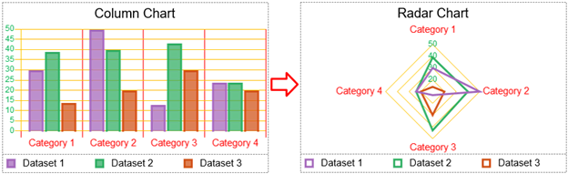
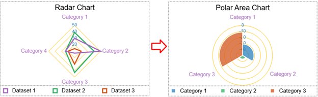
Regarding data and datasets’ styles changing, charts are divided into 2 groups. The first group includes the Column, Bubble, Bar, Line, Radar, Scatter, and Combo Column-Line charts. The second group contains the Doughnut, Polar Area, and Pie charts. When you change a chart type to others of the same group, it will keep the data and dataset styles unchanged. Otherwise, they will be reset.
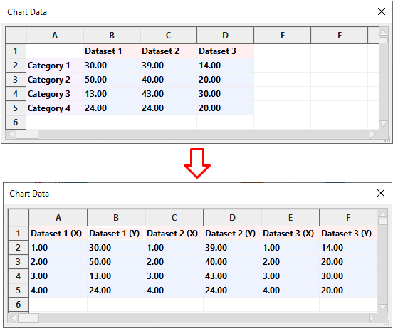
However, in the first group, the Column, Bar, Line, Radar, and Combo Column-Line chart types plot only one dimension of the datasets. Meanwhile, the Bubble and Scatter chart types plot more than one dimension. Therefore, there is one thing to be considered in data changing.
For instance, if you switch between a Column chart type and a Scatter chart type, the data values in the Column chart type will be converted to the (Y) values of the corresponding datasets in the Scatter one, and vice versa. The (X) values (Scatter and Bubble charts) and the (Size) values (Bubble charts) will be the defaults.
Change Chart Types Regarding Chart Element’s Styles
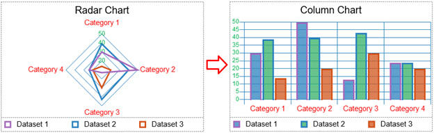
About the chart elements’ styles such as Tick Labels and Grid Lines when changing chart type, you should take notice of charts plotted with different elements (eg. the Radar and Column chart types) or with the same elements (eg. the Radar and Polar Area chart types).
For example, if you switch from a Radar chart type to Column one, the styles of the Tick Labels/ Point Label/ Grid Lines in the Radar chart will correspondingly convert to those of the Primary Vertical Tick Labels/ Primary Horizontal Tick Labels/ Horizontal and Vertical Grid Lines in the Column chart.
On the contrary, if you change from a Column chart type to the Radar one, the styles of the Tick Labels and Point Label work the same way as above; however, the styles of the Grid Lines in the Radar chart will be inherited only from the styles of the Horizontal Grid Lines in the Column chart.
Because the Radar and Polar Area chart types are plotted with the same elements, switching between these two chart types will maintain the elements’ styles.
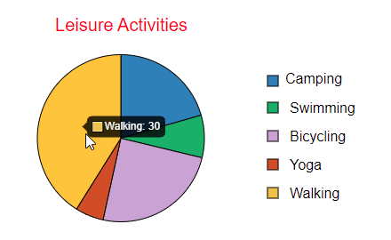
Annotate and Label Charts in HTML5 Output
Charts in ActivePresenter 9 can be annotated and labeled in HTML5 output. Viewers can hover the mouse over each dataset to see the data values.
That’s all about how to create charts and graphs in ActivePresenter 9. This new version of ActivePresenter also offers much more brand-new features. 3D models, Tables, Sliders, and Dropdowns are a few examples. So, let’s download the app and visit our Tutorials page to explore. Also, if you need any assistance while using ActivePresenter, feel free to contact us.
See also: