Line charts are best to track data changes over periods. This chart type shows data points connected by straight lines or curve lines. Today’s tutorial will give you details about how to create line charts in ActivePresenter 9.
Let’s start by walking through an example below.
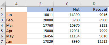
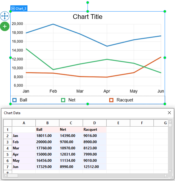
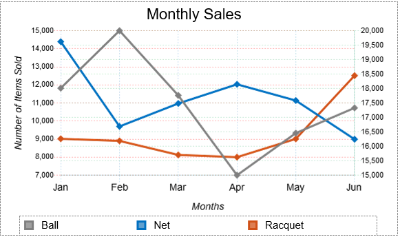
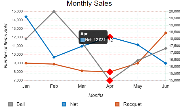
The data set above demonstrates the number of 3 tennis items sold in a sports store in the first 6 months of the year. You can visualize it in a flash using a line chart.
This tutorial covers 5 main parts:
- Insert Line Charts
- Edit Data for the Line Charts
- Change the Line Charts’ Styles
- Adjust Charts’ Layout
- Preview and Export the Charts
Insert Line Charts
To insert a Line chart, do as follows:
- Access the Insert tab > Chart.
- Click the Line chart type on the left pane in the Insert Chart dialog.
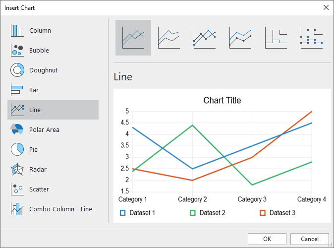
At the top of the dialog, you can see there are 6 variations of the Line chart. They are Line, Stacked Line, Line with Markers, Stacked Line with Markers, Stepped, and Stepped with Markers.
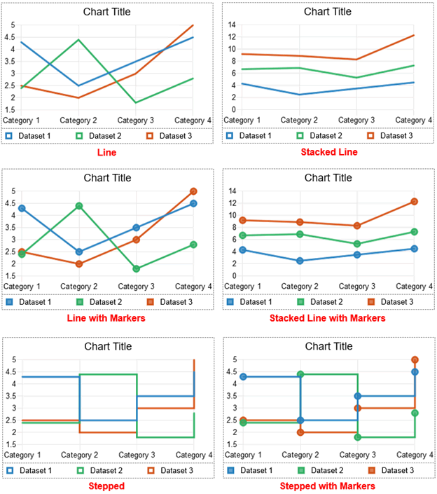
- Line: Presents values over time across evenly spaced categories on straight lines or curve lines.
- Stacked Line: Shows values that are cumulative at each category on straight lines or curves.
- Line with Markers: Plots the Line chart type with markers. Markers are used to visually indicate individual data values.
- Stacked Line with Markers: Plots the Stacked Line chart type with markers. Markers are used to visually indicate individual data values.
- Stepped: Depicts data values on horizontal baselines connected with vertical lines to form a series of steps.
- Stepped with Markers: Plots the Stepped chart type with markers. Markers are used to visually indicate individual data values.
- Choose either of the 6 variations. Otherwise, you can switch to the other type later.
- Click OK to insert.
Edit Data for the Line Charts
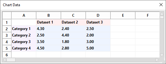
Once you’ve done inserting a line chart, you are free to adjust the default data values in the following dialog:
Note: If the dialog is not shown up, you can right-click the chart > select Edit Chart Data.
Working with the Chart Data cells is quite similar to working with cells in Excel spreadsheets. Now replace the default data with your own:
- Select the Dataset cells and change texts as Ball, Net, and Racquet respectively.
- Change and add texts in the Category cells into 6 months.
- Select the value cells and enter your data values.
After that, all the changes will show up in the chart immediately.
Change the Line Charts’ Styles
ActivePresenter 9 lets you change the styles of the datasets, gridlines, tick labels, and axis labels of the line chart above. See the following image for a better understanding:
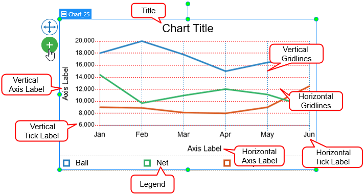
Note: Some elements are not shown by default. You can select the chart > click on the plus button ![]() > choose to show or hide any elements.
> choose to show or hide any elements.
To change the styles of those elements, you access the chart Properties pane > Chart > Style.
Customize Datasets
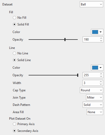
The Dataset means data values presented in colored lines. You can click the drop-down Dataset list to switch to any dataset to customize.
Fill
This option is only available for the following chart types: Line with Markers, Stacked Line with Markers, Stepped with Markers, and chart types with the Area Fill option enabled. Here, you can customize the background fill of markers and/or the area covered by the data values and markers.
Line
Fill the line of each dataset with a single color or not. In addition, change the color, transparency, and width of the line as you wish. There are also properties you might take notice of as below.
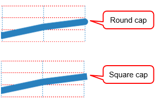
- Cap Type: Since the end of each dataset is an open line, you can let its end have either a square or round cap type.
- Join Type: Change the type of the join where two lines in a dataset intersect with each other. Choose either Round, Bevel, or Miter.
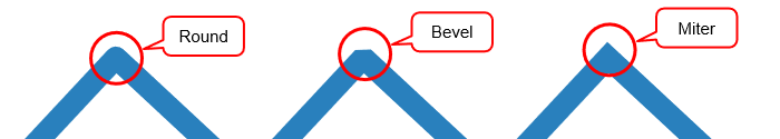
| Round | The corner where two lines connect is rounded. |
| Bevel | The corner where two lines connect is cut off at a 45-degree angle. |
| Miter | The corner where two lines connect is squared off. |
- Dash Pattern: Change the pattern of the dataset’s interpolation lines. Select either of the four types: Solid, Dot, Dot Dash, and Dash.
- Area Fill: Fill the area between the dataset’s interpolation lines and the origin, start, or end boundary with a solid color.
| Origin | Fill the area from the dataset’s lines to the gridline at the origin. |
| Start | Fill the area from the dataset’s lines to the gridline at the min value. |
| End | Fill the area from the dataset’s lines to the gridline at the max value. |
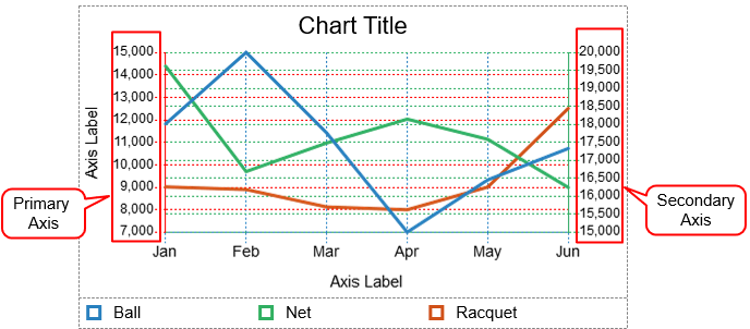
Plot Dataset On
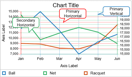
Choose between Primary Axis and Secondary Axis to plot a dataset on. In the Line chart, the primary axis is on the left side while the secondary axis is on the right side. You can use a secondary axis when the data values vary greatly between one another without the need for additional charts.
Note: You cannot plot all the datasets in the secondary axis.
For example, the dataset Ball (blue-colored) is plotted on the Secondary axis following green dash lines while the others are plotted on the Primary axis following red dash lines.
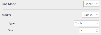
Change Line Mode, Stepped & Marker Style
You are free to choose whether the dataset lines are straight or curved without or with 5 inbuilt marker styles.
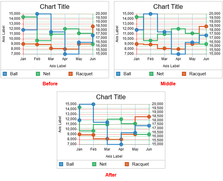
For the Stepped chart type, there are also 3 options to adjust the step in the interpolation line between two data points of the dataset.
| Before | The step is formed at the value of the second data point. It is enabled by default. |
| Middle | The step is formed at the value in the middle of two data points. |
| After | The step is formed at the value of the first data point. |
Customize Scale Options
Scale options include gridlines, tick labels, and axis labels corresponding to the axis that the dataset is plotted on.
You click the drop-down Axis list to choose one of the chart axes to customize its properties. There are four types of axes: Primary Horizontal, Primary Vertical, Secondary Horizontal, and Secondary Vertical.
Note: The properties for the Secondary Horizontal and Secondary Vertical options are only available when you plot at least one dataset on the Secondary axis.
Gridlines
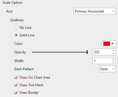
Gridlines are lines that cross the chart area to indicate the divisions on the axes. You can choose to draw gridlines of the currently selected axis with a single color or not. Adjust the transparency and the width of the gridlines the way you want.
- Dash Pattern: Change the pattern of gridlines, either Solid or Dash.
- Draw On Chart Area: Tick the checkbox to draw horizontal/vertical gridlines on the chart area. Drawing gridlines helps viewers understand what values are represented by unlabeled data points.
Note: There are no Secondary Vertical gridlines in the Line charts.
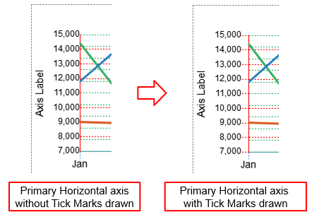
- Draw Tick Mark: Tick the checkbox to draw lines that extend the gridlines from the axis border to the tick labels.
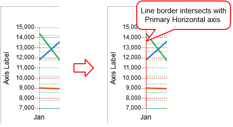
- Draw Border: Tick the checkbox to draw a line border at the edge intersecting with the corresponding axis.
Tick Labels
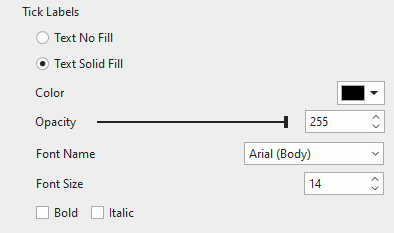
Fill the tick labels of the corresponding axis with a single color. You can also change the font name, font size, and make the tick labels bold and/or italic the way you want. Otherwise, if you want the axis to have no tick labels, just select Text No Fill.
Axis Label
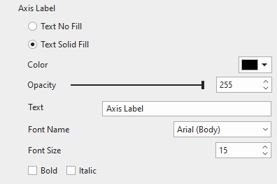
Fill the axis label of the corresponding axis with a single color. Enter a new name of the axis label in the Text field. Moreover, change the font name, font size, bold, and/or italicize the axis label as your like. If you don’t want to show the axis label, select Text No Fill.
Note: The Secondary Horizontal axis has no tick labels and axis label.
Adjust Charts’ Layout
By default, the Line chart has the Flex layout. That means you cannot adjust the chart parts manually. To make changes, you can access the chart Properties pane > Size & Properties > Container Layout.
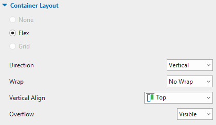
In addition, select each chart part and then customize it in the Properties pane > Size & Properties > Flex Child.
We end up with something like this:
Preview and Export Line Charts
In the HTML5 output, viewers can hover the mouse over the datasets to see the data labels as follows:
That’s how to create the Line charts in ActivePresenter 9. Download and create your first charts and graphs right now!

If you need any assistance, don’t hesitate to contact us via email support@atomisystems.com or the online user community.
Related articles: