Pie charts are suitable if you want to show each data item’s distribution relative to the total value. That is to say, this chart type depicts data in a circular graph divided into slices. Keep reading this tutorial to learn more!
Similar to the Doughnut charts, the Pie charts are also ideal to express the “part-to-whole” relationship. However, the total value in a Pie chart is shown as a sole pie. Each slice represents a numerical value. It may be bigger or smaller depending on the value.
Let’s take a deep dive with an example as follows:
Suppose you want to illustrate the proportions of leisure activities using a Pie chart in ActivePresenter 9. Here are the steps we go:
- Insert Pie Charts
- Edit Data for Pie Charts
- Change Pie Charts’ Styles
- Adjust Chart Layout
- Preview and Export the Charts
If you haven’t installed ActivePresenter 9 yet, just click the button below to download its latest version:

Insert Pie Charts
To insert a Pie chart, follow these steps:
- Open the Insert tab > Chart.
- Select Pie on the left pane in the dialog that pops up.
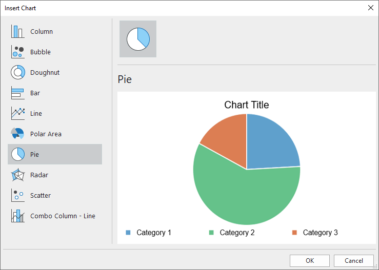
3. Click OK to finish.
Edit Data for Pie Charts
Once you have done inserting, the Chart Data window coming up with default values shows up on the Canvas.
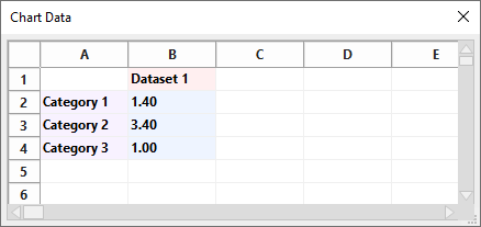
Note: When you select the chart, this window should appear. If not, you can right-click the chart > select Edit Chart Data.
Now, let’s change the defaults with your data:
- Select and change the text in the Dataset 1 cell into other texts. This step is optional since there is only one dataset applicable in a Pie chart.
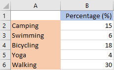
- Change texts in the Category cells into names of leisure activities.
- Select the value cells and enter your data values.
For more information, please refer to the Edit Chart Data section in this tutorial.
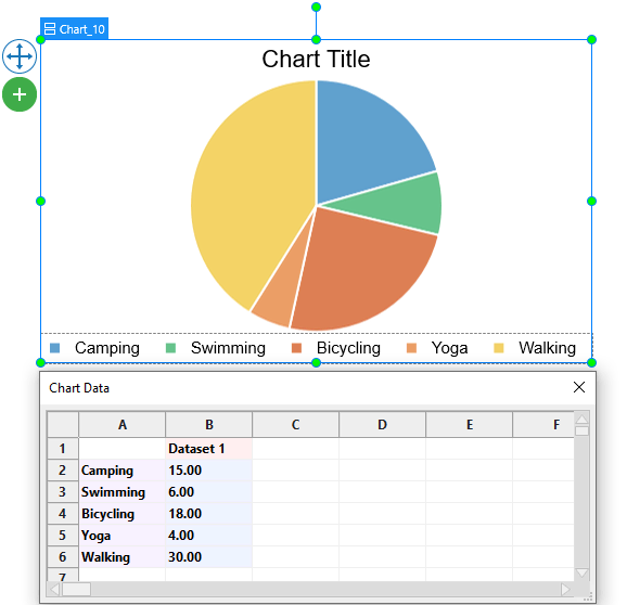
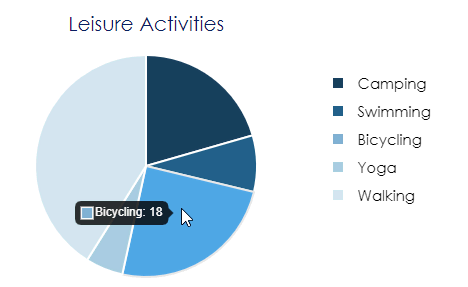
Your chart will show all the changes you have made as follows:
Change Pie Charts’ Styles
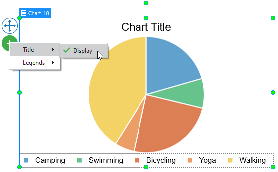
You can choose to show or hide the chart title and chart legends. To get it done, click on the plus button ![]() > choose to show/hide any elements.
> choose to show/hide any elements.
Moreover, you are free to edit styles for the chart dataset and categories the way you want. Just navigate to the chart Properties pane > Chart > Style.
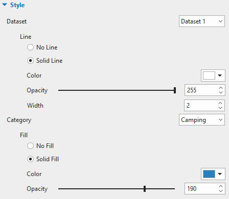
Customize Dataset
In the Pie chart, there is only one dataset which is represented as the whole pie. The Dataset section allows you to set the line border of the dataset and the border between categories also.
Customize Categories
The Category means a data value depicted in a colored slice. In this section, you can customize the background fill of each category. Click the drop-down Category list to choose one of the categories to restyle.
Adjust Chart Layout
If the default chart layout does not satisfy you, you can change it in the chart Properties pane > Size & Properties > Container Layout.
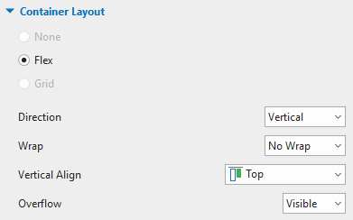
Moreover, chart parts cannot be repositioned manually due to being snapped to the Flex layout. In this case, you can select each chart part. Then adjust it in the Properties pane > Size & Properties > Flex Child.
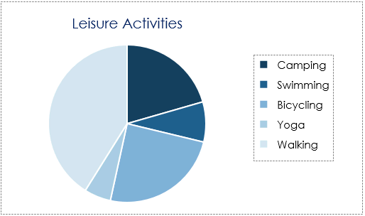
The chart below illustrates what the final result may look like.
Preview and Export Pie Charts
When viewers hover the mouse over a category in the HTML5 preview or HTML5 output, they will see the corresponding data label.
Working with the Pie charts in ActivePresenter 9 is quite easy, isn’t it? Now, let’s download the app and see how amazing your charts will be. Also, feel free to contact us if you need any assistance.
Related articles: