Just like Column charts, Bar charts are ideal for showing trend data or comparisons among items or categories. But when there are a great number of categories, using Bar charts is a better choice. Let us explain them to you in this tutorial.
A bar chart plots data in rectangular horizontal bars whose lengths are proportional to the values. In which, categories are organized along the vertical axis and values along the horizontal axis. Therefore, you can add as many categories as you want without considering the limited space.
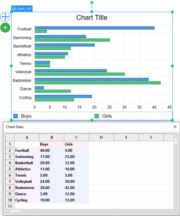
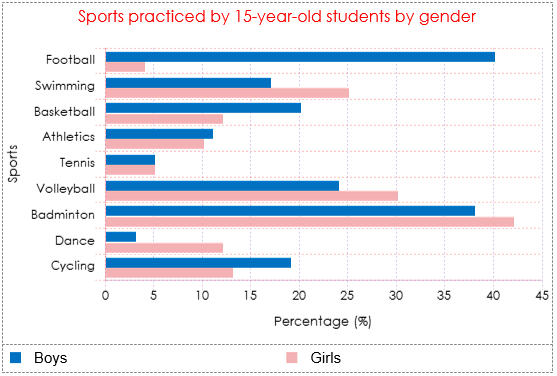
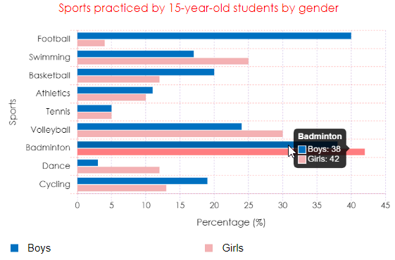
Let’s take an example. The data set below shows the percentages of 10 sports practiced by 15-year-old students in a high school by gender.
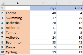
Since there are a great number of categories, you can consider using a Bar chart to visualize that data effortlessly.
Download the latest version of ActivePresenter 9 if you’ve not done yet.

You will walk through 5 following main parts:
- Insert Bar Charts
- Edit Data for Bar Charts
- Change Bar Charts’ Styles
- Adjust Chart Layout
- Preview and Export the Charts
Insert Bar Charts
To insert a Bar chart, do the following steps:
- Click the Insert tab > Chart.
- Click the Bar chart type on the left pane in the Insert Chart dialog that appears.
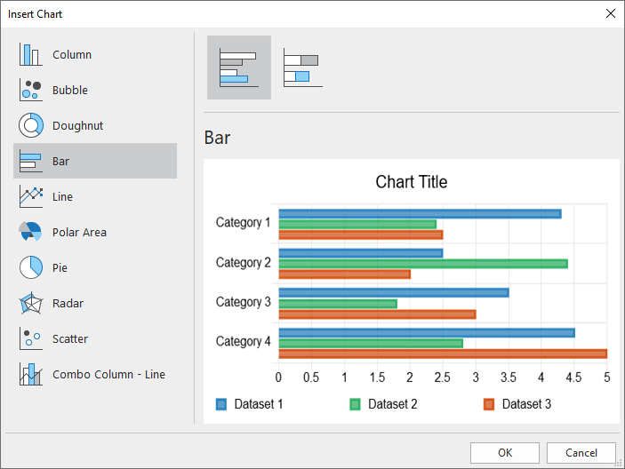
At the top of the dialog, you can see 2 available variations of the Bar chart. They are Bar and Stacked Bar in turn.
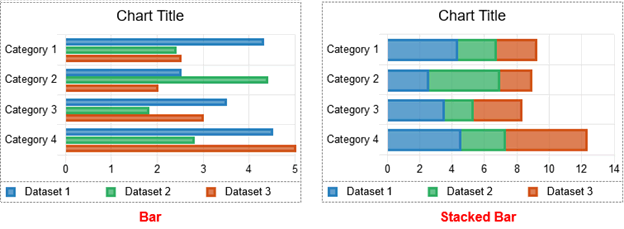
- Bar: Compares individual data values in the same category or across categories, and displays them horizontally.
- Stacked Bar: Compares the total of data values across categories as well as shows the relative contribution of each data value to the total by displaying values in horizontal stacks.
- Choose either of the two variations. Otherwise, you can switch to the other later.
- Click OK to insert.
Edit Data for Bar Charts
After inserting a chart, the Chart Data window pops up with some values added by default.
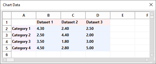
Note: When you select the chart, this window should appear. If not, you can right-click the chart > select Edit Chart Data.
Now you need to replace the defaults with your data:
- Select the two first Dataset cells and change texts as Boys and Girls respectively.
- Remove Dataset 3 by clicking on the label D to select the entire column, then right-clicking it > Delete.
- Change and/or add texts in the Category cells into the names of Sports.
- Select the value cells and enter your data values.
For other detailed manipulations, please refer to the Edit Chart Data section in this tutorial.
In the chart, you will immediately see all the changes that have been made.
Change Bar Charts’ Styles
Firstly, let’s take a look at some of the Bar chart’s elements. Then, you will have a better understanding of which elements need to be customized.
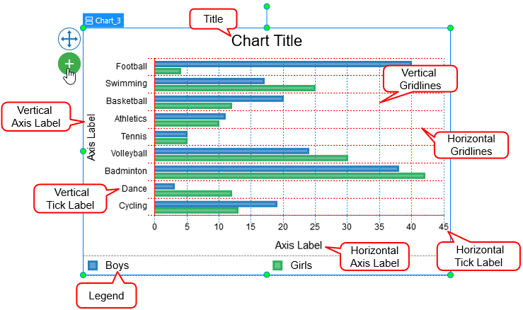
Note: Some elements are not shown by default. You can select the chart > click on the plus button ![]() > choose to show or hide any elements.
> choose to show or hide any elements.
There are several options for chart-style customizations in the chart Properties pane > Chart > Style. This section allows you to customize the background fill and line of the datasets, as well as gridlines, tick labels, and axis labels.
Customize Datasets
The Dataset means data values presented in colored horizontal bars. Click the drop-down Dataset list to switch to any dataset you want to customize.
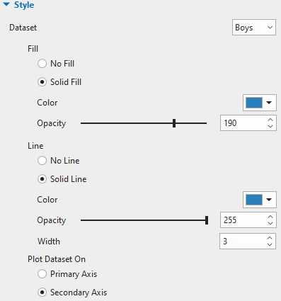
- Fill and Line: Fill the dataset and its line border with a single color, respectively.
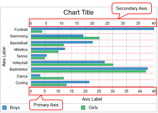
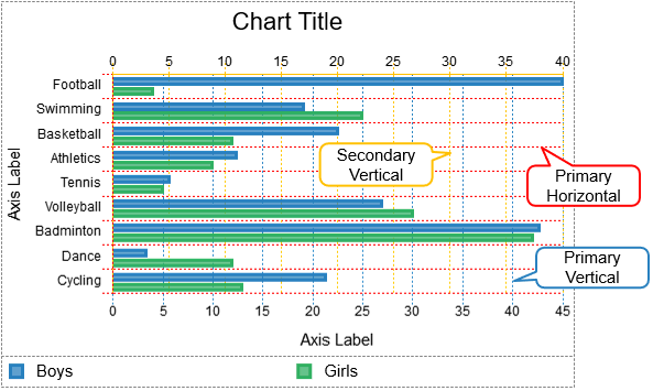
- Plot Dataset On: Choose between Primary Axis and Secondary Axis to plot a dataset on. In the Bar chart, the primary axis is located at the bottom of the chart and the secondary axis is at the top. You can use a secondary axis when data values vary greatly between one another without the need for additional charts.
Note: You cannot plot all the datasets in the secondary axis.
For example, the dataset Boys (blue-colored) is being plotted on the secondary axis while the other is plotted on the primary axis.
Customize Scale Options
In this section, feel free to adjust the gridlines, tick labels, and axis labels corresponding to the axis that the dataset is plotted on.
Click the drop-down Axis to choose one of the chart axes to customize its properties. There are four types of axes: Primary Horizontal, Primary Vertical, Secondary Horizontal, and Secondary Vertical.
Note: The properties for the Secondary Horizontal and Secondary Vertical options are only available when you plot at least one dataset on the Secondary axis.
Gridlines
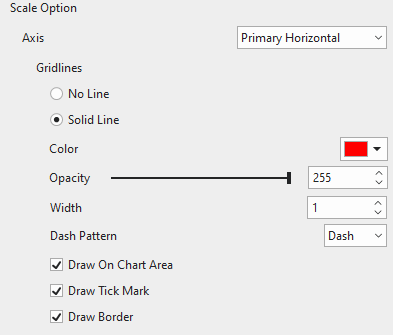
Gridlines are lines that cross the chart area to indicate the divisions on the axes. You can choose to draw gridlines of the currently selected axis with a single color or not. Adjust the transparency and the width of the gridlines the way you want.
- Dash Pattern: Change the pattern of gridlines.
- Draw On Chart Area: Tick the checkbox to draw horizontal/vertical gridlines on the chart area. Drawing gridlines helps viewers understand what values are represented by unlabeled data points.
Note: Since the Bar chart is a horizontally-oriented chart, there are no Secondary Horizontal gridlines.
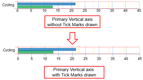
- Draw Tick Mark: Tick the checkbox to draw lines which are the extension of the gridlines from the axis border to the tick labels.
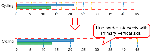
- Draw Border: Tick the checkbox to draw a line border at the edge intersecting with the corresponding axis.
Tick Labels
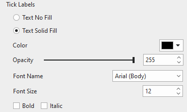
Fill the tick labels of the corresponding axis with a single color. You can also change the font name, font size, and make tick labels bold and/or italic the way you want. Otherwise, if you want the axis to have no tick labels, just select Text No Fill.
Axis Label
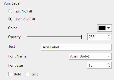
Fill the axis label of the corresponding axis with a single color. Enter a new name of the axis label in the Text field. Moreover, change the font name, font size, bold, and/or italicize the axis label as your like. If you don’t want to show the axis label, select Text No Fill.
Note: The Secondary Vertical axis has no tick labels and axis label.
Adjust Chart Layout
Chances are you want to re-organize the chart layout, you can do that by accessing the chart Properties pane > Size & Properties > Container Layout.
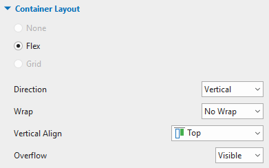
The Bar chart has the Flex layout by default. Since the chart parts are snapped to the Flex layout, you cannot adjust them manually. Instead, you can select each chart part and then customize it in the Properties pane > Size & Properties > Flex Child.
After you have customized the chart, it should look like this:
Preview and Export Bar Charts
In the HTML5 output, data values will be shown when viewers hover the mouse over the datasets. This makes it easier for viewers to understand the data.
So you’ve learned the ways to work with the Bar charts in ActivePresenter 9. The coming tutorial will show you a different chart type ActivePresenter 9 offers – the Line charts. So, don’t miss it out.
Related articles: