The Column chart is one of the 10 major chart types ActivePresenter 9 offers. It is best suited when you want to illustrate data changes over time or comparisons among items or categories. Let’s explore how to work with column charts further!
In ActivePresenter 9, a Column chart presents data in rectangular vertical bars whose heights are proportional to the values. In which, categories are distributed on the horizontal axis while values are organized on the vertical axis.
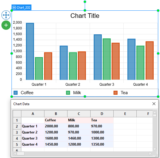
Let’s start out with the following simple data set:
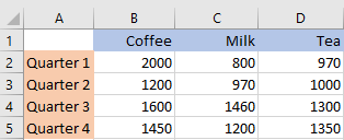
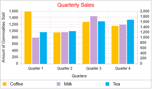
Suppose that you want to compare the total units sold of three commodities, namely Coffee, Milk, and Tea, broken down by financial quarters. The data can be visualized using a Column chart without any effort in ActivePresenter 9.
Download the app below and explore!

Today’s tutorial will walk you through 5 main parts:
- Insert Column Charts
- Edit Data for Column Charts
- Change Column Chart’s Styles
- Adjust Chart Layout
- Preview and Export Column Charts
Insert Column Charts
To insert a Column chart, take the following steps:
Step 1: Click the Insert tab > Chart.
Step 2: In the Insert Chart dialog that appears, click the Column chart type on the left pane.
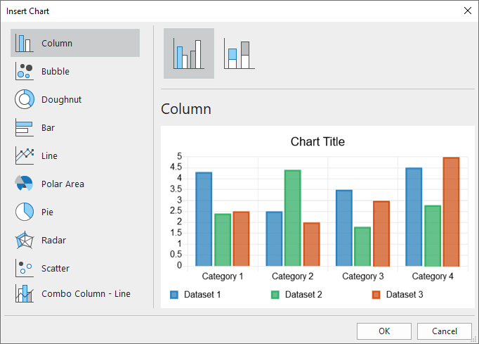
At the top of the dialog, you can see there are 2 available variations of the Column chart. They are Column and Stacked Column in turn.
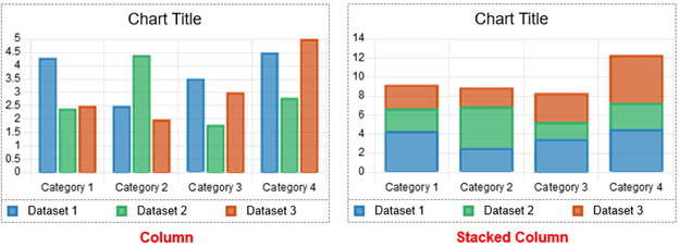
- Column: Compares individual data values in the same category or across categories and displays them vertically.
- Stacked Column: Compares the total of data values across categories as well as shows the relative contribution of each data value to the total by displaying values in vertical stacks.
Step 3: Choose either of the two variations. Otherwise, you can switch to the other type later.
Step 4: Click OK to insert.
Edit Data for Column Charts
After inserting a chart, you are free to edit the default data values in the Chart Data window that pops up.
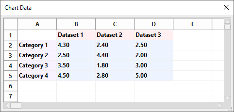
Note: When you select the chart, this window should be shown up. If not, you can right-click the chart > select Edit Chart Data.
Working with chart data is quite similar to working with cells in Excel spreadsheets. Now you need to replace the defaults with your data:
- Select the Dataset cells and change texts to Coffee, Milk, and Tea respectively.
- Change texts in the Category cells into 4 Quarters, similarly.
- Select the value cells and enter your data values.
Note: You are free to add or delete any Dataset and/or Category as you want. For other detailed manipulations, please refer to the Edit Chart Data section in this tutorial.
After that, you will see all the changes are reflected in the chart immediately.
Your chart should look like this:
Change Column Charts’ Styles
If the default chart styles do not satisfy you, you can access the chart Properties pane > Chart > Style. There are several options for chart-style customizations.
First of all, let’s distinguish some elements available on the Column chart. This will give you a better understanding of elements to be customized later.
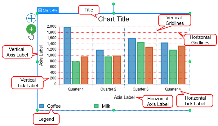
Note: Some elements are not shown by default. You can select the chart > click on the plus button ![]() > choose to show or hide any elements.
> choose to show or hide any elements.
The Style section (Chart tab > Style) in the Properties pane allows you to customize the background fill and line of the datasets, as well as gridlines, tick labels, and axis labels.
Customize Datasets
The Dataset means data values presented in colored vertical bars. Click the drop-down Dataset list to switch to any dataset you want to customize.
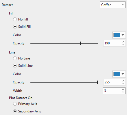
- Fill and Line: Fill the dataset and its line border with a single color, respectively.
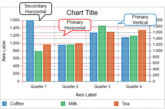
- Plot Dataset On: Choose between Primary Axis and Secondary Axis to plot a dataset on. In the Column chart, the primary axis runs along the left side of the chart and the secondary axis runs along the right side. You can use a secondary axis when the data values vary greatly between one another without the need for additional charts.
Note: You cannot plot all the datasets in the secondary axis.
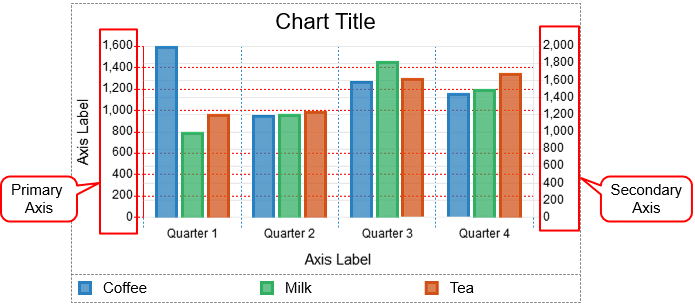
For example, in the chart below, the Coffee dataset (blue-colored) is plotted on the Secondary axis while the others are plotted on the Primary axis.
Customize Scale Options
In this section, feel free to adjust the gridlines, tick labels, and axis labels corresponding to the axis that the dataset is plotted on.
Click the drop-down Axis list to choose one of the chart axes to customize its properties. There are four types of axes: Primary Horizontal, Primary Vertical, Secondary Horizontal, and Secondary Vertical.
Note: The properties for the Secondary Horizontal and Secondary Vertical options are only available when you plot at least one dataset on the Secondary axis.
Gridlines
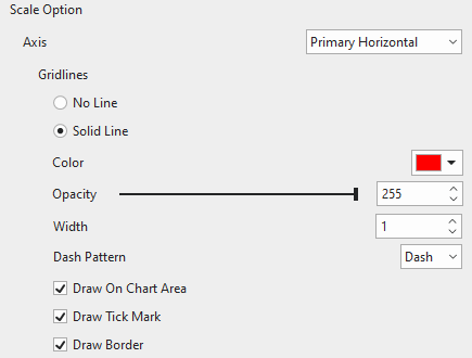
Gridlines are lines that cross the chart area to indicate the divisions on the axes. You can choose to draw gridlines of the currently selected axis with a single color or not. Adjust the transparency and the width of the gridlines the way you want.
- Dash Pattern: Change the pattern of gridlines, either Solid or Dash.
- Draw On Chart Area: Tick the checkbox to draw horizontal/vertical gridlines on the chart area. Drawing gridlines helps viewers understand what values are represented by unlabeled data points.
Note: Since the Column chart is a vertically-oriented chart, there are no Secondary Vertical gridlines.
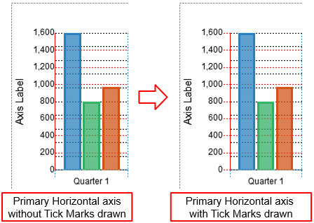
- Draw Tick Mark: Tick the checkbox to draw lines which are the extension of the gridlines from the axis border to the tick labels.
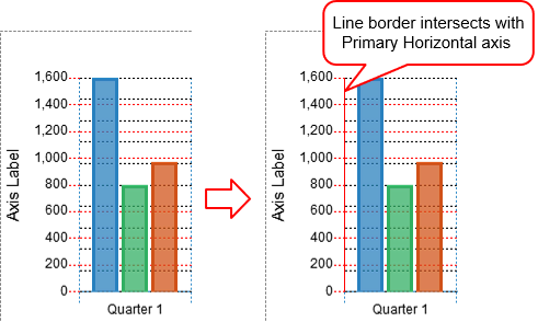
- Draw Border: Tick the checkbox to draw a line border at the edge intersecting with the corresponding axis.
Tick Labels
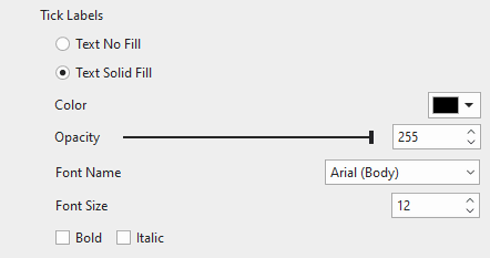
Fill the tick labels of the corresponding axis with a single color. You can also change the font name, font size, and make the tick labels bold and/or italic the way you want. Otherwise, if you want the axis to have no tick labels, just select Text No Fill.
Axis Label
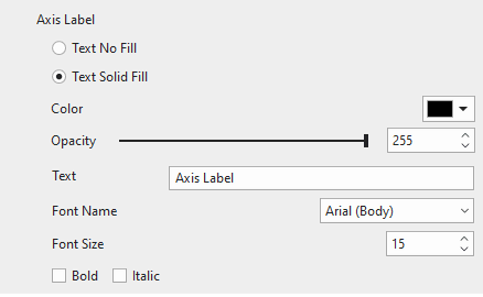
Fill the axis label of the corresponding axis with a single color. Enter a new name of the axis label in the Text field. Moreover, change the font name, font size, bold, and/or italicize the axis label as your like. If you don’t want to show the axis label, select Text No Fill.
Note: The Secondary Horizontal axis has no tick labels and axis label.
Adjust Chart Layout
Chances are you want to re-organize the chart layout, you can do that with ease. The whole chart has the Flex layout by default. You can adjust the chart layout in the chart Properties pane > Size & Properties > Container Layout.
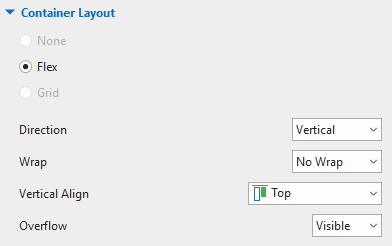
Besides, since the chart parts are snapped to the Flex layout, you cannot adjust them manually. Instead, just select each chart part then customize it in the Properties pane > Size & Properties > Flex Child.
Once you’ve done customizing the chart, the result should be somehow as follows:
Preview and Export Column Charts
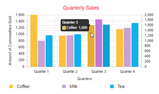
It’s great if viewers can see the data labels in the output. Fortunately, ActivePresenter 9 allows you to do that. In the HTML5 output, viewers can hover the mouse over the datasets to see the data values. Let’s see:
So now you know how to work with the Column charts in ActivePresenter 9. Why don’t you try this feature right now? Give the app a go and see the benefits it can bring to your work. Moreover, feel free to ask us if you need any help.
Related articles: