Polar Area charts are quite similar to Pie charts. However, this chart type is widely used to plot cyclic data. If you want to create a Polar Area chart then ActivePresenter 9 will help you in no time.
If you are new to the Polar Area chart, you can search for one of the most famous use cases of this chart type. That is the “Diagram of the causes of mortality in the army in the East” by Florence Nightingale. In fact, this chart shares almost the same properties as the Pie chart but is more complex. Although both present data in a circular graphic, the Polar Area has segments with equal angles. And the radius varies with the value. In other words, this chart type displays data along the angular and radial axes.
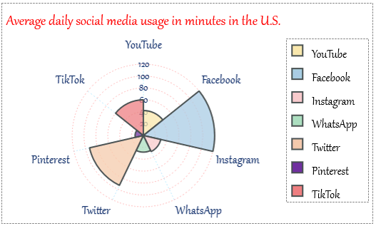
For example, you can use a Polar Area chart to illustrate the average daily social media usage in minutes in the U.S., ranked by the number of active users.
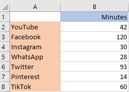
Data source: techjuri.net
Follow the steps below:
- Insert Polar Area Charts
- Edit Data for Polar Area Charts
- Change Polar Area Charts’ Styles
- Adjust Chart Layout
- Preview and Export the Charts
Insert Polar Area Charts
To insert a Polar Area chart, do the following:
- Click the Insert tab > Chart.
- Click the Polar Area chart type on the left pane in the Insert Chart dialog that appears.
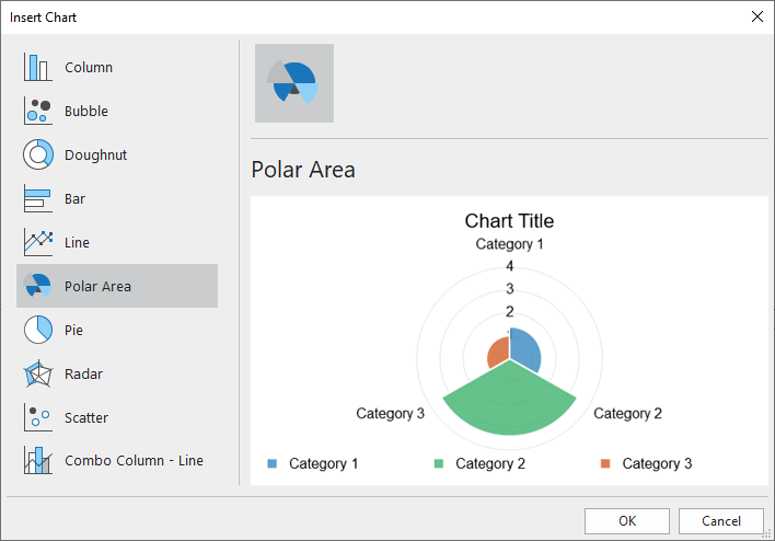
- Click OK to insert.
Edit Data for Polar Area Charts
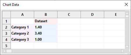
After inserting, you can see the Chart Data window shows up on the Canvas with default values.
Note: When you select the chart, this window should pop up. If not, you can right-click the chart > select Edit Chart Data.
Now, let’s change the defaults with your data:
- Change texts in the Category cells into social media sites.
- Optionally select and change the text in the Dataset cell into other text. Just like the Pie chart, a Polar Area chart has only one dataset.
- Select the value cells and enter your data values.
For more information, please refer to the Edit Chart Data section in this tutorial.
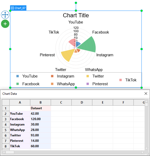
After that, you will see all the changes are reflected in the chart below:
Change Polar Area Charts’ Styles
To customize the Polar Area chart’s styles, you should know the elements available on it first.
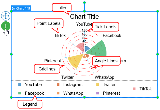
Note: Some elements are not shown by default. You can select the chart > click on the plus button ![]() > choose to show or hide any elements.
> choose to show or hide any elements.
After that, just navigate to the Properties pane > Chart > Style. Here, you are free to edit styles for the chart dataset, categories, and scaling options the way you want.
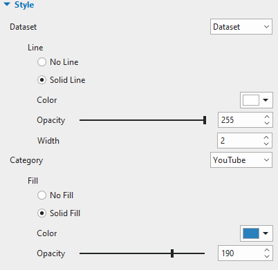
Customize Dataset
The Dataset section allows you to set the line border of the dataset and the border between categories.
Change Categories’ Background Fill
The Category means data values depicted in colored segments. In this section, you can customize the background fill of each category.
Customize Scale Options
In this section, you can adjust the gridlines, angle lines, tick labels, and point labels of the chart.
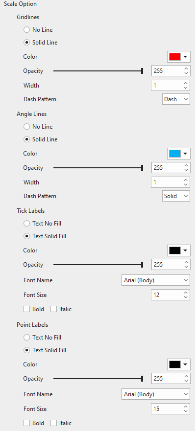
Gridlines
Gridlines are circles around the chart area to indicate the divisions on the chart. They also play the role of radial axes. You can choose to draw gridlines in a single color or not. Adjust the transparency, width, and pattern of the gridlines the way you want.
Angle Lines
Angle lines are line borders of angles, which extend from the center point to the maximum magnitude of the gridlines. They serve as angular axes. It is up to you whether you want grid lines drawn in a single color or not. Make the gridlines transparent, wide, or pattern as you like.
Tick Labels
This section lets you customize the tick labels of the chart such as text color, transparency, font, and font size.
Point Labels
In this section, you can customize the point labels of the chart just like the tick labels above.
Adjust Chart Layout
If you are not satisfied with the default chart layout, you can change it in the chart Properties pane > Size & Properties > Container Layout.
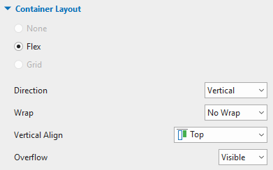
The Flex layout is set by default. That means you cannot reposition chart parts manually. Instead, you can select each chart part, then adjust it in the Properties pane > Size & Properties > Flex Child.
In the end, the final result may look like this:
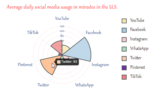
Preview and Export Polar Area Charts
Data labels can be revealed when viewers hover the mouse over a category on HTML5 preview or HTML5 output.
That’s all about working with Polar Area charts in ActivePresenter 9.
Why don’t you download the app and try this chart type right now?

Also, there are many tutorials about the brand-new features on our Tutorials page. Curious? Let’s come and learn.
Related articles: