One of the key features of ActivePresenter 9 is the responsive design. It allows you to create a single project that displays precisely as it should on any device, regardless of the screen size. Let’s learn how to create a responsive project in this tutorial.
Why do you need to create a responsive design in your project? You can visualize this better by looking at the example below:
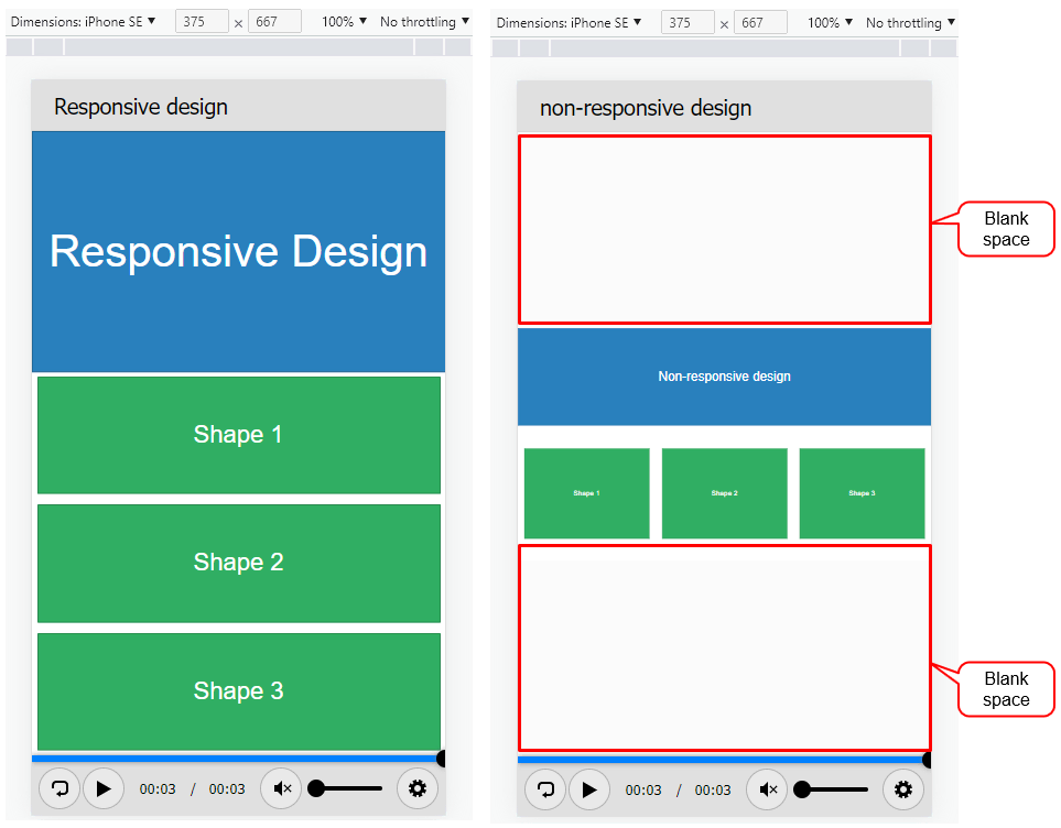
As can be seen, with the responsive design, the content is scaled, arranged, and displayed to perfectly fit the devices’ screen sizes. Without it, the content can still be displayed on the screen, but only scaled in auto fit mode, or there will be unnecessary spaces like in the image.
In other words, while created on PCs, responsive projects can be arranged, resized, hidden, shrank, and enlarged on tablets, phablets, and phones automatically. You can leverage the device screen characteristics. For example, if the height of a device like a mobile is greater than the width, it makes the content and objects look more clearly without overflowing or blank spaces.
Today, you will learn how to create a responsive project in ActivePresenter 9. The procedure should be:
- Create a Responsive Project
- Manage Responsive Layouts
- Change Slide Container Layout
- Change Object Position
- Convert Between Responsive and Non-Responsive Projects
Now, let’s download ActivePresenter 9 and try creating a responsive project.

Create a Responsive Project
To create a responsive project, do any of the following:
- In the Start Page > Responsive Project.
- In the workspace > ActivePresenter > Responsive Project.
Then, you will see the newly created project looks like this:
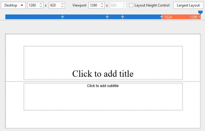
By default, ActivePresenter defines five responsive layouts which correspond to the most popular device screen sizes:
| Desktop with a viewport of 1280×620 |
| Tablet Landscape with a viewport of 1024×674 |
| Tablet Portrait with a viewport of 768×930 |
| Mobile Landscape with a viewport of 667×345 |
| Mobile Portrait with a viewport of 375×522 |
Note: Those layout sizes are not the device viewport sizes. Their selection ensures that the content will display correctly on popular devices. In case you wish to support a specific device, you can create a custom responsive layout.
Next, let’s learn how to manage the responsive layout in ActivePresenter 9.
Manage Responsive Layouts
In this section, we will know how to:
- Switch Between Layouts
- Add New, Rename, and Remove Layouts
- Change Viewport Width
- Change Layout Height
- Change Slide Height
- Inherit Properties of Layouts
Switch Between Layouts in a Responsive Project
On the Responsive Bar, the currently selected layout is orange. To switch between layouts, click one of those layouts on the bar. Alternatively, click the drop-down arrow (1) and select one of the available layouts in the list.
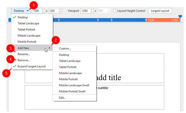
Add New, Rename, and Remove Layouts
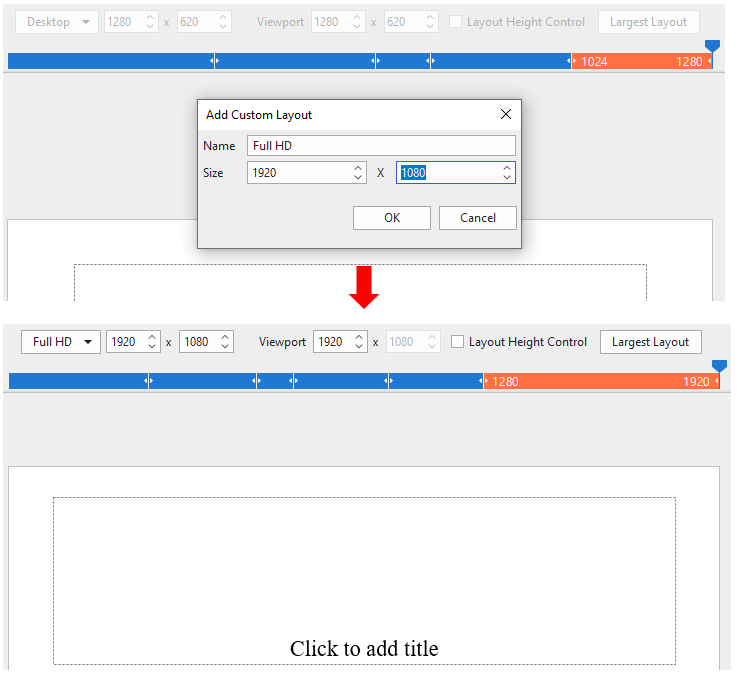
Furthermore, you can add a new layout. Click (2) > Custom… In the Add Custom Layout dialog, type a name and adjust the size of the layout. Then, click OK to finish.
The app also allows you to rename (3) or remove any layout (4).
Change Viewport Width
Drag the handle on the Responsive Bar left or right to change the viewport width. It is previewed in the Viewport.
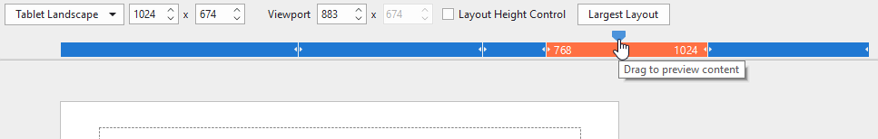
In most cases, the width of the new layout must be within the range of the currently selected layout’s width. For example, if you are selecting the Tablet Landscape device layout, you can only drag the slider within the width range (768, 1024].
Additionally, by default, the Expand Largest Layout option (5) lets the slide be the full width of the device.
Change Layout Height
The layout height (6) is used as the standard size for slide height (7) when previewing on Canvas. For example, by default (in the 100% Device Height mode), the layout height will act as the device height. It helps you to preview the content without running on the actual device.
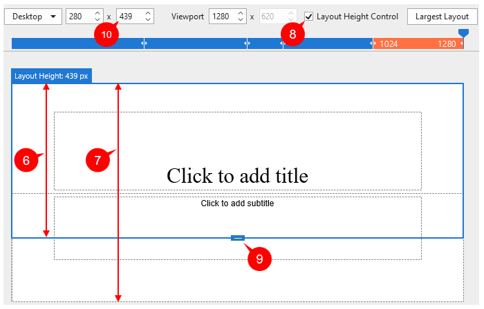
Follow these steps to show and change the layout height:
- To show the layout height: Tick the Layout Height Control checkbox (8) on the Responsive bar. Then, a blue-bordered rectangle appears. It matches the slide’s border.
- To change the layout height: Drag the layout height control (9) up or down. Another way is to change the value in the Layout Height spin box (10). Do that by clicking the up/down arrow or entering a new value in the combo box.
Change Slide Height
You can change the slide height by navigating to the Properties pane > Slide Properties tab > Slide Height section.
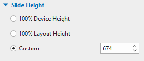
Here, you have three options to adjust the slide height:
- 100% Device Height: Device Height is the height of the device’s screen. This is the default option. Then, the slide height 100% matched the device height.
- 100% Layout Height: Check this button then the slide height will 100% fit the layout height.
- Custom: Enter a value in the spin box, or click the up/down arrow to increase/decrease the slide height respectively. It specifies the slide height independently from the layout height.
Note: If the slide height is larger than the device height (in case you select 100% Layout Height or Custom), viewers can view the content beyond the layout by scrolling the bar on their devices.
Inherit Properties of Layouts
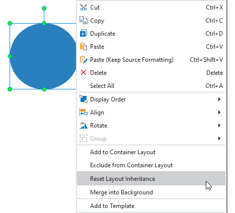
In a responsive project, a layout inherits properties from a larger layout. This is called layout inheritance.
For example, you inserted an object (the blue oval in the example above) in the Desktop as the largest layout. When you switch to other smaller layouts on the left, the oval retains its properties. If you change the object’s position in the Table Landscape layout, that property will be inherited in all smaller layouts while it keeps unchanged in the larger layout (Desktop).
Note: If you already changed the properties of that object in a smaller layout, it won’t inherit those from its larger layout.
From then on, if you wish to change any properties, you should do so first on the largest layout.
And, after making changes to these properties of a smaller layout, if you don’t need it anymore, simply reset it. Just right-click the object > Reset Layout Inheritance.
Change Slide Container Layout in a Responsive Project
In a responsive project, flex and grid containers can lay out and align objects automatically to fit different viewport sizes. As a result, you can manage layout and spacing consistently and efficiently.
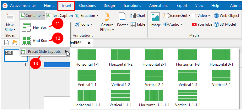
To add flex or grid containers, open the Insert tab > Container > Flex Box (11) or Grid Box (12). To save time when designing slides, select Preset Slide Layout (13). The app made preset slide layouts with the default flex container layout.
After that, you can change the Flex Child, Container Layout (if any), and Text Box’s properties in the Size & Properties tab of the Properties pane.
Change Object Position
Flex and grid layouts allow objects to be automatically aligned across different viewport sizes. It is also possible to change their positions manually with the values and properties. In detail, you can change the objects’ position mode, size, and value unit.
Change Object Position Mode
Position mode allows pinning objects to the corner of the slide. As a result, they can be set to relative the top left, top right, bottom right, and bottom left corner of the slide. It affects how the objects adapt to the viewport size changes.
To access the object position mode, select the object > Properties pane > Size & Properties tab > Transform section > Position Mode (14). Then, select one of the 4 radio buttons corresponding to the 4 modes.
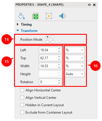
Change Object Position and Size
After choosing a position mode, now you are able to change the relative distance from an object to the pinned corner of the slide.
For example, in the picture above, you are choosing the position mode as Top Left (the currently selected radio button). Therefore, in (15), the Left and Top spin boxes are shown. You can see their values are 19.54% and 62.17%, respectively. It means, the position of the object to the left edge and top edge equal 19.54% and 62.17% of the width and height of the viewport. It will always keep its relative distance to these edges regardless of the viewport sizes.
Now, to change the object position, enter the new values to the spin boxes as you wish.
Additionally, it’s easy to resize the object. To do that, just change the value in the Width and Height spin boxes in (15). However, there are 2 types of units: % and pixel. To know how different the objects look in each unit, let’s go to the next part.
Change Object Position and Size Value Unit
You can change the unit of object position and size value between percentages (%) and pixels (px) in (16).
- Choose % if you want the object size and position to be a percentage of left/top/width/height. Using a percentage unit keeps the position and size of objects relative to the viewports.
- Choose px if you want the object size and position to be a number of pixels of left/top/width/height. The size and position of the object keep unchanged when you change the viewport of the current layout.
- Choose Auto in one of the Width or Height spin boxes to retain the aspect ratio. For example, if you choose Auto in the Height spin box, the object height will automatically change according to the width.
Convert Between Non-Responsive and Responsive Project
If you have a non-responsive project and now want to make it display well on mobile devices, just convert it to a responsive one. It’s a breeze in ActivePresenter 9.
To do that, click the ActivePresenter button > Project > Convert to Responsive Project…
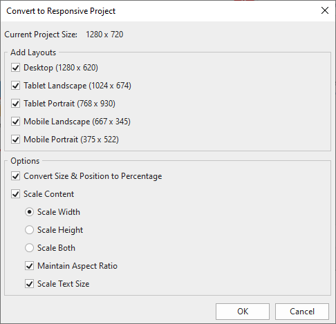
Next, select the layout you want to preserve in the Add Layouts section. You can also choose to convert size & position to percentage as well as scale content in the Options section. When all the settings satisfy you, click OK. The current project will turn into a responsive project with the layouts you have selected.
Likewise, you’re able to convert a responsive to a non-responsive if needed.
That’s how to create a responsive project and how to manage its layout in ActivePresenter 9. Don’t forget to follow our Tutorials page and YouTube channel to know more about other features of the app. If you have any questions, feel free to contact us at the email support@atomisystems.com.
See more: