How to Work with Check Boxes and Radio Buttons in ActivePresenter 8
When building an eLearning course, it’s likely that sometimes you want to use check boxes and radio buttons. These interaction objects allow users to select options from a list.
In this tutorial, let’s learn how to work with these objects in ActivePresenter 8.
Insert Check Boxes/ Radio Buttons
Do either of the following ways:
- Open the Insert tab > Check Box/ Radio Button.
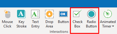
- Open the Home tab > Interactions > Check Box/ Radio Button.
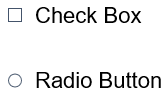
By default, these objects will appear on the Canvas with the default text:
Click on the default text to enter the new text. Besides, you can format text attributes such as font, paragraph settings, alignment, and indentation.
Customize Check Boxes/ Radio Buttons
Initially, these interaction objects appear on the Canvas with the default format. Its color comes from theme colors.
You can use the properties in the Format tab to change the default format as you wish.
In detail, you can:
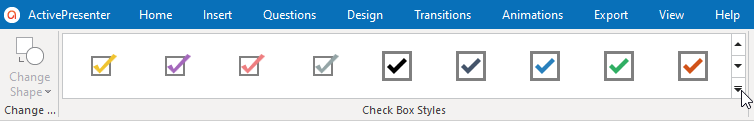
- Change its styles: Click on the bottom arrow to display the Check Box Styles/ Radio Styles gallery and select the new style that you want:
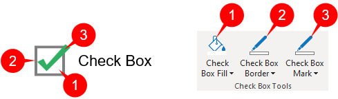
- Change colors: To change colors, click on one of three buttons in the Check Box Tools or Radio Tools section. You can change its background color (1), the color and the width of the border (2), and the mark color (3).
After customizing it, you can set it as the default style so that the same attributes will be applied to all the newly added objects in the same project. To do that, right-click it > Set as Default Check Box/ Set as Default Radio Button (4).
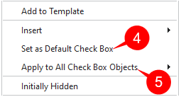
If you want to apply the new changes to all existing check boxes/ radio buttons in that project, right-click it > Apply to All Check Box Objects /Apply to All Radio Button Objects (5) > Style.
Insert and Customize Feedback Messages
You can add two feedback messages, including Timeout Message and Hint Message:
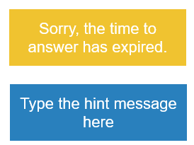
- Timeout Message will be shown when users don’t complete an action in the predefined time.
- Hint Message will appear when users hover the mouse over it.
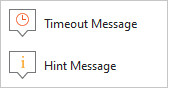
To add those messages, open the Questions tab > Message. Or, right-click on a button > Insert. Then, select a message from the list:
After that, you can customize feedback messages as you wish.
For more information, please refer to How to work with Feedback Messages.
Work with Multiple States
Similar to a button object, a check box or radio button object comes with built-in states which control its look when users interact with it.
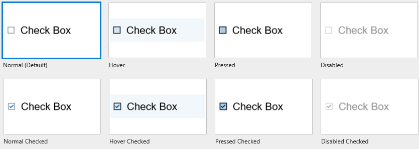
By default, it has 8 states as described below:
- Normal (Default): This is the initial state when it first appears in the output.
- Hover: The state when users hover over it.
- Pressed: The state when users click on it.
- Disabled: The state when it is disabled. In this state, it is still visible to users, but they cannot interact with it.
- Normal Checked, Hover Checked, Press Checked, Disabled Checked: These are the states of selected check boxes or radio buttons.
You can customize those built-in states or add more states if necessary.
See Work with Object States for more details.
Add Events – Actions
A check box/ radio button object does not have default events – actions. However, when you add feedback messages to it, ActivePresenter will automatically add events – actions to make the newly added message to be shown in the output.
Besides, you can add more events – actions to make it interactive in the way you want.
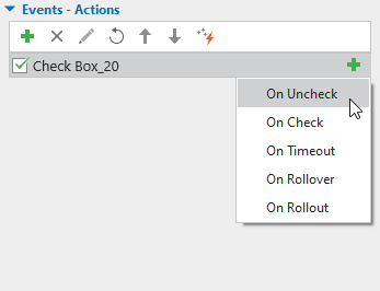
Below is the explanation for the meaning of each event:
- On Uncheck: Occur when users uncheck it.
- On Check: Occur when users check it.
- On Timeout: Occur when users don’t respond within the specified time.
- On Rollover: Occur when the mouse rolls over it.
- On Rollout: Occur when the mouse rolls out of it.
After adding events, continue adding actions to events, and conditions to actions if necessary.
See Work with Events – Actions to know how to do that.
That’s how to insert and customize checkboxes and radio buttons in ActivePresenter 8. Download ActivePresenter and make your course more interactive.
Visit the following links if you want to know how to work with other interaction objects: