If you are a web designer, you must have known the importance of flex box and grid box in creating responsive projects. These two web layout techniques are the most widely used for various layout tasks, and they each work best under different circumstances. This is also the reason why ActivePresenter adopts these functions for creating container layouts, especially in responsive projects. Therefore, in this tutorial, I am guiding you on when and how to use flex box with a practical example in detail. Besides, we will discuss the second type of layouts in the next tutorial post: Working with Grid Box in ActivePresenter 8.
What is a Flex Box?
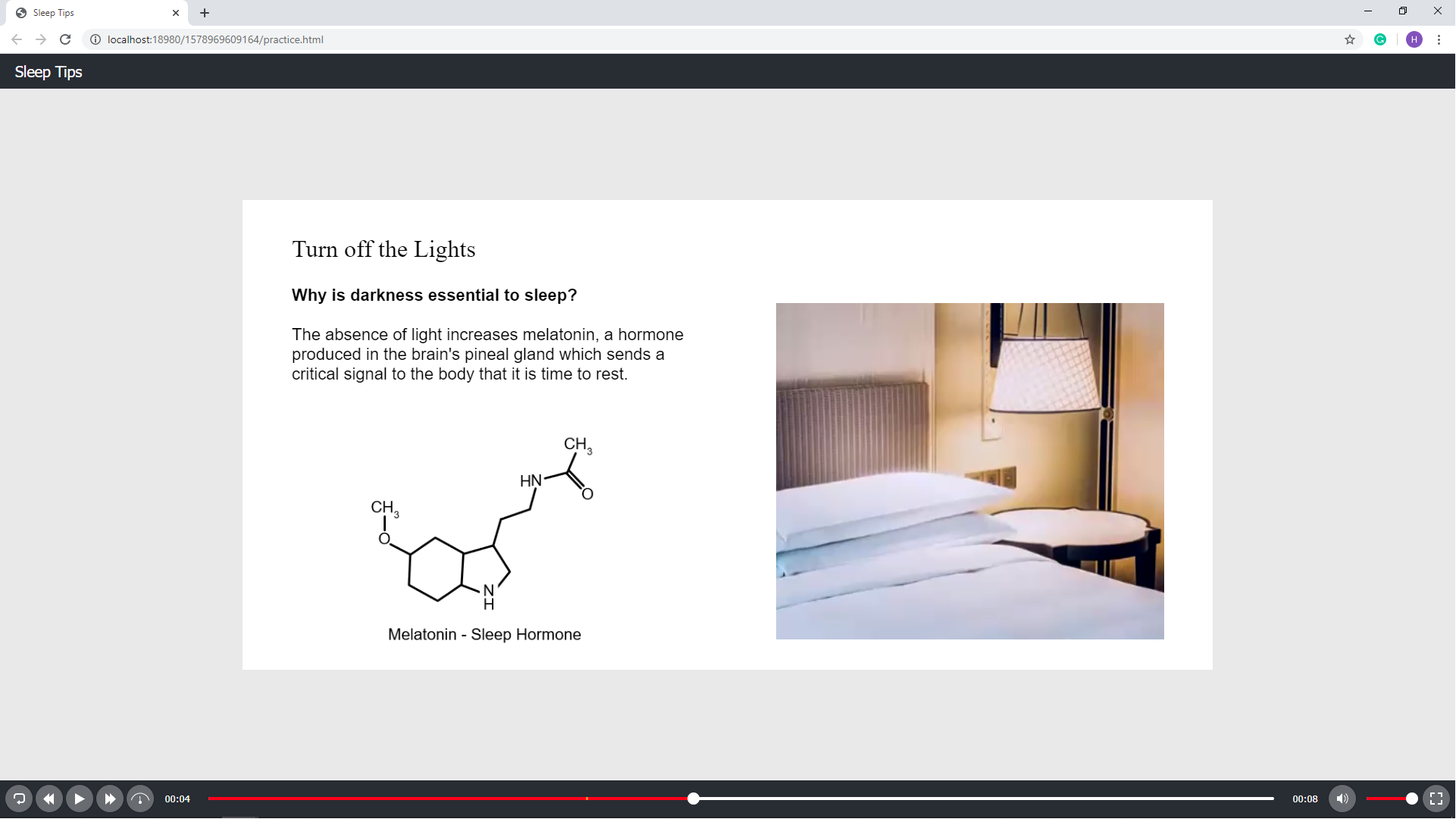
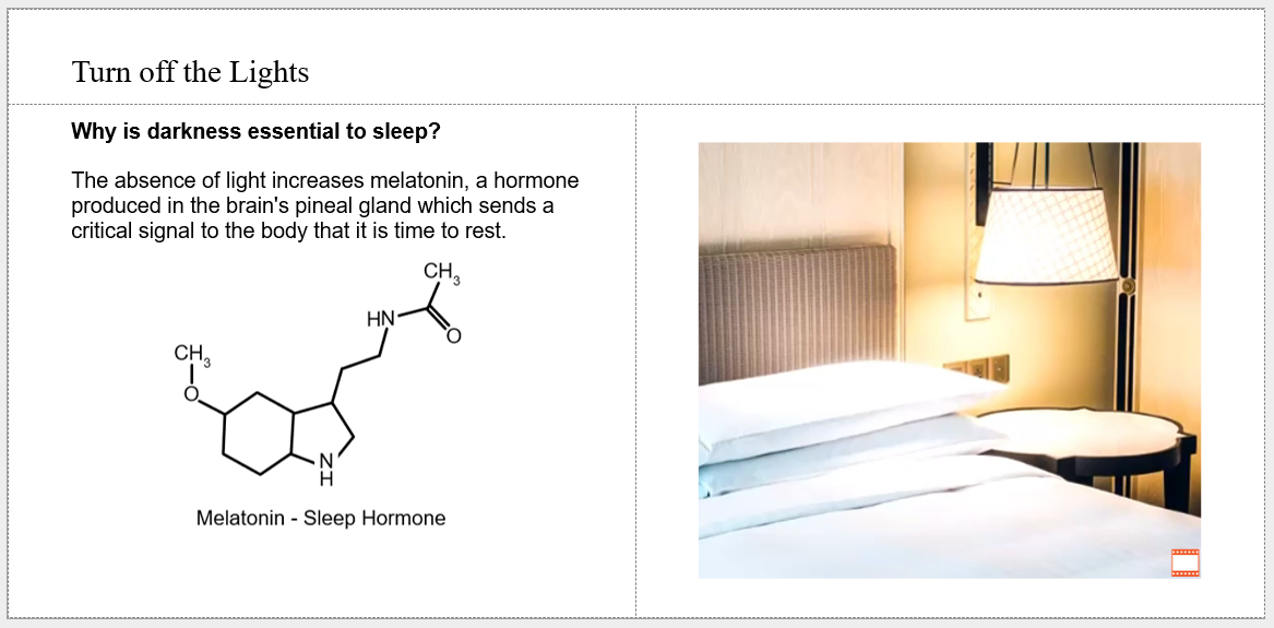
Flex box is simply a flex container that can hold objects. However, it is made for one-dimensional layouts, which means a flex box can be laid out either horizontally or vertically. Therefore, a flex box is the best for arranging items in either a single row or a single column. So as to give you a common use case for flex box, I’m going to create a basic slide that includes a title and 2 columns of content in a responsive project.
Using Preset Slide Layout
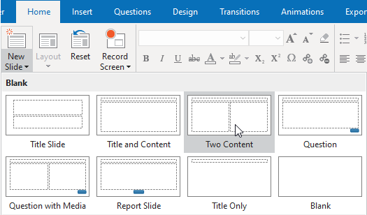
When opening a new responsive project, you will notice that the slide has its own flex layout by default. But you can also consider using other preset slides by going to the Home or the Insert tab, and then clicking the down arrow on the New Slide button to choose the slide layout you want. For example, I will add the Two Content slide.
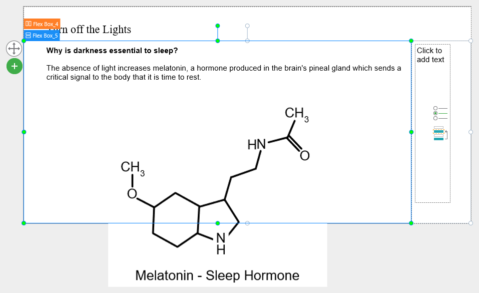
As you can see, this slide contains perfectly arranged flex containers with their placeholders where you can add any content you want. I’m going to add text and an image to the placeholder on the left, and then continue to add an image below it by clicking Flex Box_5. After that, I click the plus icon and select Objects, then choose Image.
Creating Your Own Slide Layout
In case the preset slide layout gallery doesn’t have the layout you want, just create your own one.
Inserting Flex Box
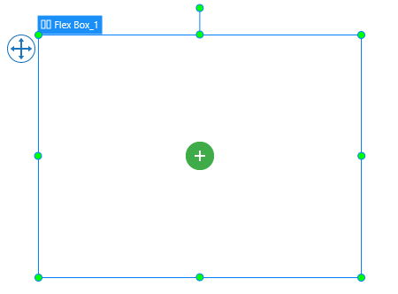
To insert a flex box to your project, in the Home or Insert tab, click the Container  button and then click Flex Box. After that, a flex box will appear on the canvas like this:
Adding Child for Flex Box
When you add an object to a flex box, the object is called a flex item or flex child. You can directly insert children whether they are objects or questions to a flex box; or add a child container such as a flex box, a grid box, and a preset layout.
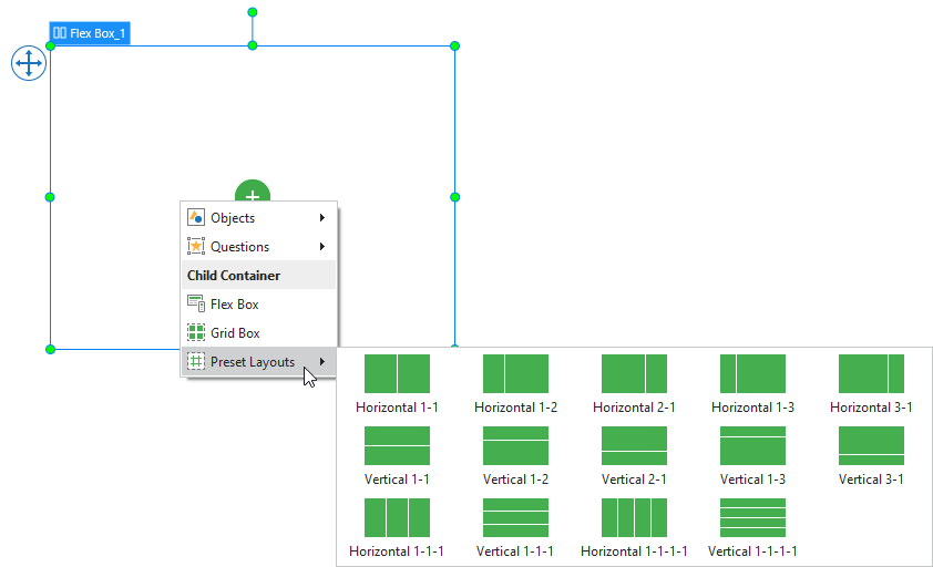
Adding Child Container
You can further add a child container to a flex box by clicking the plus button, then select 1 out of the 3 options in the Child Container drop-down list.
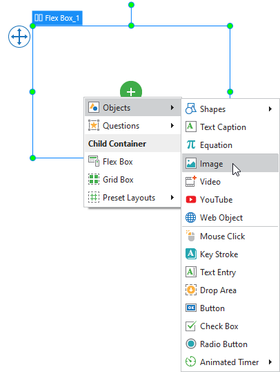
Adding Objects or Questions
Apart from child container, you can also add objects or questions to flex box as follows: you simply click the plus button in the middle of the box, then select either Objects or Questions and choose the one that you need.
Customizing Flex Child in Flex Container
A flex child can adjust itself to fit the container. The Properties pane is where you find all the tools to customize the flex child. To access it, you simply select a flex child, then navigate to the pane on the right side of the working window. In the Properties pane, Size and Properties tab, click Flex Child.
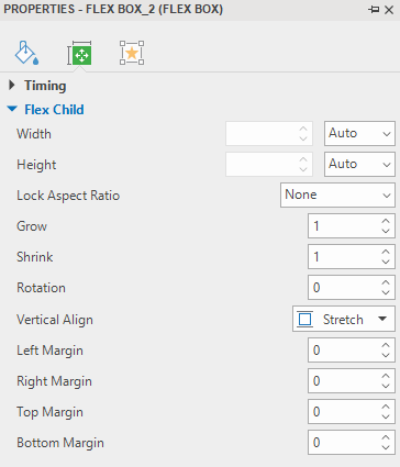
Properties of Flex Child
- Width/Height: Define the base width/height of a flex child by percentage, pixel or auto. Auto means the base width/height is based on the object content. The content can be either text if the object is a shape or the total base width/height of children if the object is a nested flex box.
- Lock Aspect Ratio: Select Width or Height to maintain the aspect ratio of a flex child according to its width or height respectively. If selecting None, you can freely resize both the width and the height.
- Grow: Specify how the free space of flex box is distributed to its children in the value range from 0 – 100. If the value is equal to 0, a flex child keeps its base size. Otherwise, depending on the Direction set in its flex container, a flex child will grow in width or height to occupy the free space in the flex container.
- Shrink: shrink objects that have a greater total base size than the container size to fit the container. Specify the value from 0 – 100. If the value is equal to 0, a flex child keeps its base size. Otherwise, depending on the Direction set in its flex container, a flex child will be shrunk in width or height to fit the container.
- Rotation: Specify the value to rotate a flex child.
- Horizontal/Vertical Align: Appear if the Direction in a flex container is set to Vertical/Horizontal. Then, select one of four options in the list to align a flex child horizontally/ vertically.
- Left/Right/Top/Bottom Margin: Adjust margin on the left/right/top and bottom side.
Customize Flex Child
Going back to my example, I am going to customize the content and its flex containers in the Properties pane as follows:
- First, for the Flex Box_5 (flex container), I change the Width to 50%, Grow to 0.
- Then, for the text (content_1), I change the Grow to 0, Bottom Margin to 10.
- Then, for the image, I change the Lock Aspect Ratio to Height, Width to 53%.
- I continue to add a video to the placeholder on the right by clicking the video icon and then selecting From File…
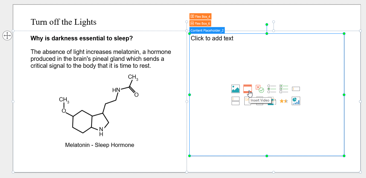
The video size is locked to width by default, so I will change the Lock Aspect Ratio to Height, and Width to 80%.
The placeholder (Flex Box_6) is a child of Flex Box_4 and it is vertically aligned to the top by default. I want to align the image to the center of the placeholder so I will change its Vertical Align to Middle.
Properties of Flex Container Layout.
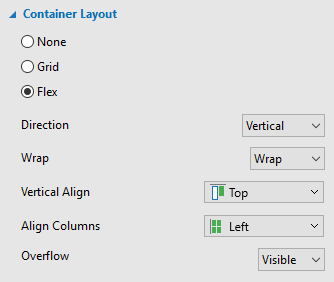
Direction
Flex layout will keep objects displaying along a row (in the horizontal direction) or a column (in the vertical direction). Select the direction (either Horizontal or Vertical) that you want to align objects.
Wrap
Select No Wrap or Wrap to specify whether objects should be in one line or wrapped onto multiple lines.
Note that the wrapping behavior only happens when items in a flex box are too large to display all in one line. In this case, when you select Wrap, they will be wrapped onto another line.
Vertical Align/Horizontal Align:
Select one of the following commands for aligning items vertically/horizontally
| Vertical Align | Horizontal Align | Function |
| Top | Left | Align items to the top/left of the container if the direction is vertical/horizontal. |
| Middle | Center | Align objects to the middle/center of the container if the direction is vertical/horizontal. |
| Bottom | Right | Align objects to the bottom/right of the container if the direction is vertical/horizontal. |
| Space Between | Space Between | Align the flex items evenly with equal space among rows/columns if the direction is vertical/horizontal. Besides, there is no space before the first flex item and after the last flex item. |
| Space Around | Space Around | Align the flex items evenly with equal space among rows/columns. |
Align Columns/Align Rows
When the Wrap option is selected, flex box allows breaking objects into multiple lines. Use the following properties to align those lines:
| Align Columns | Align Rows | Function |
| Left | Top | Align item to the left/top of column/row if the direction is vertical/horizontal. |
| Center | Middle | Align objects to the center/middle of column/row if the direction is vertical/horizontal. |
| Right | Bottom | Align objects to the right/bottom of column/row if the direction is vertical/horizontal. |
| Stretch | Stretch | Stretch the flex items to fill the maximum size of the column/row if the direction is vertical/horizontal. |
| Space Between | Space Between | Align the flex items evenly with equal space among rows/columns if the direction is vertical/horizontal. Besides, there is no space before the first flex item and after the last flex item. |
| Space Around | Space Around | Align the flex items evenly with equal space among rows/columns. |
Overflow
Determine how the content in a flex container is displayed if it overflows the container and whether a scroll bar should appear or not:
- Visible: The overflow isn’t clipped and it renders outside the container. This is the default.
- Hidden: The overflow is clipped; any content that extends beyond the container will be hidden.
- Auto: If the overflow is clipped, a scroll bar will appear and help you view the rest of the content. Note that you can only scroll the scroll bar from left to right and from top to bottom in the flex box. Therefore, all items that overflow the left and/or top position of the flex box couldn’t be shown.
Note: When you move objects into a container layout, the objects will automatically be snapped to that layout as the Container Snapping mode (the flex box turns orange) is enabled by default. You can temporarily disable the snap behavior by holding down ALT while moving objects. Or turn this option off by clicking the View tab, then selecting Container Snapping.
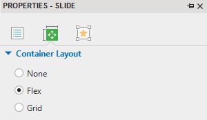
Use Flex Box as a Slide Container Layout
By default, the container layout of a slide in a normal project is None. However, it is Flex in a responsive project. In the normal project, you can change the layout container for a slide to Flex. To do that, in the Properties pane of a slide, Size & Properties tab, select Container Layout, then click Flex.
In this slide container layout, you’d better create the layout that you want right from the beginning before adding any object to it. The Preset Slide Layouts option is all you need. To access it, in the Home tab or the Insert tab, click Container, and then click Preset Slide Layouts. After that, you can easily add, arrange and customize objects inside it.
Note: When you move objects into a container layout, objects will automatically be snapped to that layout as the Container Snapping mode (the slide turns orange) is enabled by default. You can exclude any objects from the slide container layout and free to place them anywhere on the slide by doing either of the following:
- Right-click the objects, then click Exclude from Container Layout.
- Go to the Properties pane, in the Interactivity tab, navigate to the General section, then select the Exclude from Container Layout checkbox.
- You can temporarily disable the snap behavior by holding down ALT while moving objects. Or turn off this option by clicking the View tab, then choose Container Snapping.
Flex Box Tips
- In some browsers, for example, Safari, the height using percentage is not working very well, therefore, try to use grow/shrink if you can.
- As mentioned above, flex box deals with the layout in one dimension at a time. Therefore, if you want to create a two-dimensional layout, you can nest a flex container inside another one (which is known as nested flexbox).
- The Auto unit may cause the width or height of objects to be 0, which may be quite hard to edit. In this case, you can fix object size by pixel then change it to Auto later.
- If you want to separate a container into equal parts, change flex child width/height to 0% then adjust the Grow property as you want.
So, I’ve walked you through a typical case of flex box. And, don’t forget to Download ActivePresenter and start creating your very own project using flex box to boost your performance.
See Also: