Today’s post will give you a closer look at the Flexible layout. This layout uses relative units and different types of positioning to adapt the document content to the browser window size. Let’s learn how to use Flexible layout in Saola Animate 3 now!
This tutorial covers:
Set Relative Position and Size
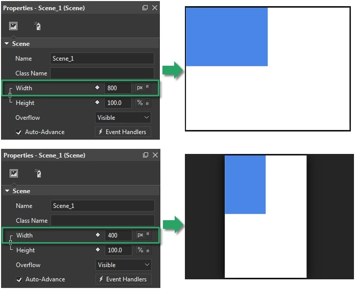
First of all, to use Flexible layout, you can define the position and size of scenes and elements in pixels (px) or percentages (%). Pixels are fixed-sized units that are not scalable. When you define the position and size of an element in pixels, the element appears as exactly that position and size no matter the viewing device.
Meanwhile, percentages are scalable units. Using percentages keeps the position and size of an element relative to its parent.
For example, by default, the scene width and height in a responsive document start at 100% of the container. This makes the document expand or contract to fill the width and height of its container. If you reduce the scene width value to 50%, the document will contract to take up half of the width of its container. Regarding relative positioning, a top-level element whose width is 50% will resize to ensure that its width is always 50% of the scene width.
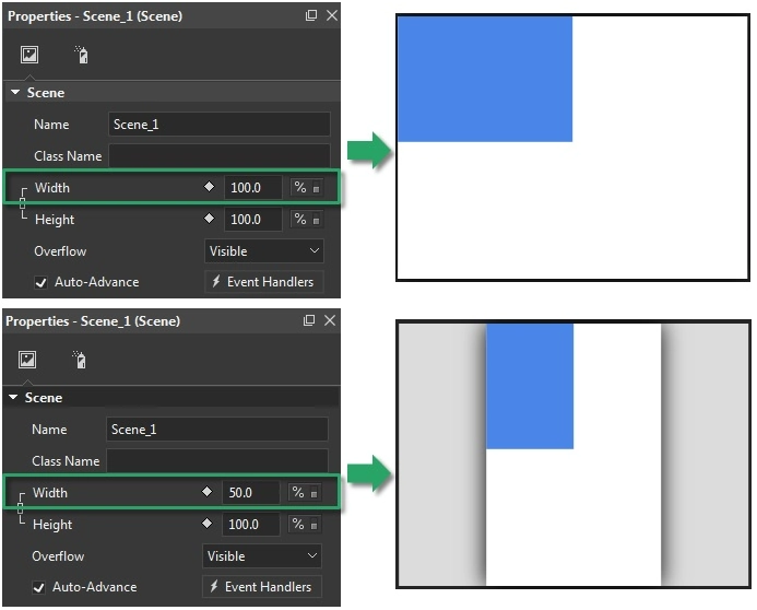
In short, to make the position and/or size of a top-level element respond to the viewport size changes, you must first set the scene size to % unit, then set the element position/size to % unit, too.
Maintain Aspect Ratio
Building responsive content, you want your content to nicely adapt to different screen sizes. You can maintain the aspect ratio of elements by setting either the width or height unit to percentages and the other unit to auto.
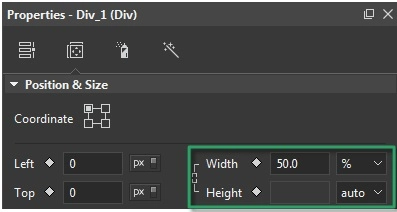
For example, set the width unit of a div element to 50% and the height unit to auto. That way, the div’s height will change proportionally to the width, ensuring the aspect ratio remains the same.
Pin Element Position
Element pining is another way to use Flexible layout in Saola Animate 3. Thanks to the Coordinate modes, you can set an element relative to the top left, top right, bottom left, or bottom right corner of its parent. This affects how the element adapts to the viewport size changes.
When you use percentages to position an element, the relative distance from that element to the pinned corner of its parent will remain unchanged. For example, you want to create a hamburger button in the top right corner of the page. The button must maintain its position to that corner regardless of the viewport size. So, you have to set the coordinate mode of the button to the top right to pin it to that corner.
The coordinate modes also affect how elements are resized. When you adjust the width or height of an element, it will shrink or grow to the opposing corner but not the pinned corner. For example, you position an element relative to the bottom right corner of the scene. When being reduced, its bottom right corner stays where it is while the rest of the element shrinks.
Align Elements
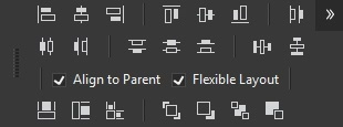
Saola Animate 3 lets you align elements with the Flexible Layout option. Elements aligned with this option will keep the layout unchanged when the parent size changes. It’s very useful for creating responsive documents. Flexible Layout alignment can work well with not only relative-sized elements in the percentage unit, but also fixed-sized elements in the pixel unit. Before applying alignment tools, you need to select both Align to Parent and Flexible Layout check boxes.
That’s how you use Flexible layout to create responsive content in Saola Animate 3. Feel free to contact us if you need any help.
Related articles: