Responsive layout is a truly responsive design method that allows you to create multiple different layouts for a single document. When viewing in a browser, the HTML5 player will load the suitable layout depending on the current device’s viewport. In this post, you’ll learn the basics of responsive layout in Saola Animate 3.
This tutorial covers:
Breakpoints and Layouts
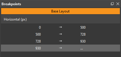
As mentioned above, the responsive layout in Saola Animate allows creating different layouts for a single document. When a responsive site reaches a certain viewport width or height, it calls new element properties and animations for that width/height. Breakpoints mark the transition to a new layout where the element properties and animations change. You can create both horizontal and vertical breakpoints.
A range is a space between two breakpoints. If a scene has only one set of either horizontal or vertical breakpoints, each horizontal/vertical range will be equal to a layout. If a scene has two sets of horizontal and vertical breakpoints, a pair of horizontal and vertical ranges will define a layout.
For example, adding only one horizontal breakpoint at 500px creates two horizontal layouts: one is from 0px to 500px and the other extends right from 500px. Meanwhile, adding one horizontal and one vertical breakpoint creates two horizontal and two vertical ranges that intersect with each other. The four grids where these ranges intersect are equal to four layouts.
When you see the output document in a browser, the HTML5 player will choose the layout based on the current device’s viewport size. Take the 500px horizontal breakpoint above as an example. Your output document has two layouts: the small layout below 500px and the large layout above 500px. If the current viewport width is smaller than 500px, the player will choose the small layout. Otherwise, it will choose a large layout. As the viewport width changes and passes 500px, the player will alter the layout, calling the new element properties and animations that fit the new width range.
Base Layout
Working on a responsive document, you’ll switch between two modes, base layout, and responsive editing mode. Each scene has a base layout whose element properties and animations will be applied to all responsive layouts. In other words, element properties and animations in responsive layouts are inherited from the base layout. In a newly created responsive document, the base layout is activated by default so that you can work on it first. Once you get things done in the base layout, you create the same set of element properties and animations in all responsive layouts. Now, switch to the responsive editing mode to customize responsive layouts. Also, create ajor or minor changes compared to the base layout.
The Viewport
By default, a responsive document has scenes whose size starts at 100% of the container. The viewport width is also set to the device width to match the virtual viewport with the device dimensions. When you’re creating responsive content, resizing the viewport helps in seeing how the output document will look across different screen sizes. You can preview your responsive content in browsers or right within the program.
Properties and Animations with Responsive Layouts
When it comes to element properties and animations, the best practice is to work in the base layout first. And later making changes in the responsive layouts. Saola Animate highlights all overridden properties, animations, and related elements in the layout they appear as well as in the base layout. It also allows you to remove overrides to revert the element properties and animations back to the default in the base layout. Just click any orange highlighted property, animation, or element and select Remove Property/Animation Override.
Related Articles: