Like flex box, grid box is a grid container that can hold objects. However, grid box is two-dimensional, which means it can be laid out both horizontally and vertically. Besides, grid box is container-based where added content will automatically be customized to fit its container. Therefore, a grid box is the best for arranging items in both rows and columns. The below example demonstrates a typical case of a grid box in a responsive project. Let’s see how to make it in detail.
Inserting Grid Box
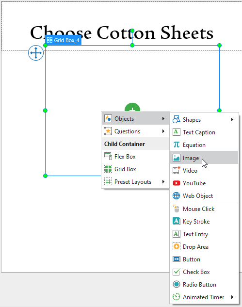
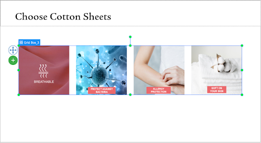
First of all, to insert a grid box, click the Home or Insert tab, then click Container and select Grid Box. In my example, I am going to add in turn 4 images demonstrating 4 reasons why you should choose cotton sheets to a grid box. To do that, I click the green circle button then click Objects to select Image, and then choose images from my computer.
Excluding Objects from Slide Container Layout
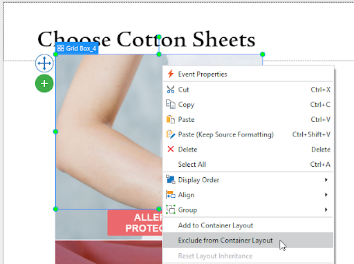
In responsive projects, once you select either Flex or Grid layout, the Container Snapping mode will be enabled by default. In other words, when you move objects into a slide container layout, objects will be automatically snapped to that layout. But you can exclude any objects from the container layout. After that, you are free to place them anywhere on the slide. To exclude objects from the slide container layout, you need to select them first, then do either of the following:
- Right-click the objects, then select Exclude from Container Layout.
- Go to the Properties pane, Interactivity tab, General section, select Exclude from Container Layout.
- You can temporarily disable the snap behavior by holding down ALT while moving objects.
- Or turn off this mode by clicking the View tab, then select Container Snapping.
Using Grid Layout
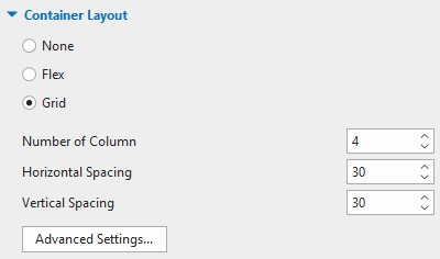
The grid size is defined by the number of columns, horizontal spacing between columns, and vertical spacing between rows. The number of rows will automatically be counted based on the number of child objects and columns. Since I want the 4 images to be in 4 columns and 1 rows, I’ll customize the properties of the Container Layout as the following image:
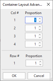
For further modification, click Advanced Settings…. A dialog appears, allowing you to define the width ratio between columns or the height ratio between rows. If the value is equal to 0, the minimum size of the objects will be used.
When viewing a grid box in different viewport sizes in a responsive project, content inside the grid box may be distorted. To avoid distortion, you will need the Transform function that defines the object position in a slide. For more information, please refer to this tutorial. In my example, I will choose Auto for the height to retain the aspect ratio and Align Horizontal Center.
Finally, I move the object to a desired position on the canvas and resize it by dragging the resizing handles.
So, that’s all about working with grid box in ActivePresenter 8. I hope that this type of layouts will help you boost your way of making your own projects. Download the app and start creating your projects from today!
See Also: