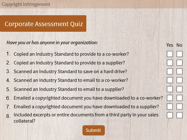
When building an eLearning course, it’s likely that sometimes you want to use check boxes and radio buttons. It can be a field in the signup form where a radio button is meant for data collection. Or, it can be a “I agree” check box to confirm learners agree to the “terms” of the course before they start. In other cases, you may want to create a list of items with a check box beside each, and learners have to check off the items that are correct. The question then arises, “How can I add, format, and work with check boxes and radio buttons?” Below is the answer.
Inserting Check Boxes and Radio Buttons
Check boxes and radio buttons are interaction objects, so go to the Interactions tab to find them. Alternatively, in the Home tab, click Interactions > select the object you want from the drop-down list.
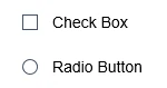
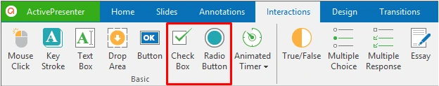
Then, on the Canvas, the object appears with default text. Click the default text to enter your text. You can format many text attributes such as font, paragraph settings, alignment, and indentation.
Note: ActivePresenter gives objects default names such as Check Box 1, Radio Button 2. You should provide them with more descriptive names so that they will be recognizable when, for example, you add actions. To rename an object, select it > Properties pane > Interactivity > General > Name.
Formatting Check Boxes and Radio Buttons
Initially, check boxes/radio buttons use their default styles in which the colors come from your theme colors. ActivePresenter lets you format the objects and change their default style at any time. To do that, select an object and go to the Format tab in the tabbed toolbar.
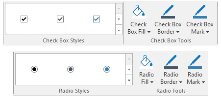
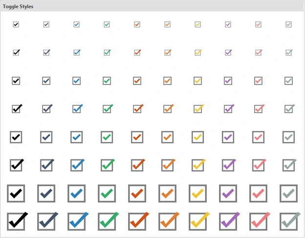
Changing Button Styles
ActivePresenter offers a gallery of ready-made check box/radio button styles. Use these galleries to choose the style you want.
Changing Button Colors
The built-in colors of the check boxes and radio buttons may look good but they haven’t satisfied you yet, you can freely customize the colors for your objects as you want.
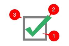
First, select the object. Then, in the Format tab, click one out of three following buttons to change the colors:
- Check Box/Radio Fill (1): Define the background color of the button.
- Check Box/Radio Mark (2): Define the color of the check mark or radio dot (when the button is checked).
- Check Box/Radio Border (3): Define the color and style of the border. Choose Width to change the border thickness.
Setting Default Button Styles
You can set a certain check box/radio button as the default style so that the same attributes will be applied to all the new check boxes/radio buttons in the same project. To do that, right-click a check box/radio button > Set as Default Check Box/Radio Button (4).
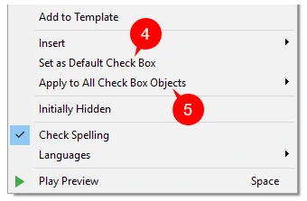
Note: This method only takes effect to newly added objects. If you want to apply the new default style to existing objects, right-click an object > Apply to All Check Box/Radio Button Objects (5) > Style.
Working with States
Check boxes and radio buttons come with eight built-in states which control their appearance when users interact with them. When you hover over the button or click it, the way it looks changes accordingly.
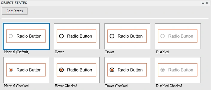
You can modify any of the built-in states and even create custom states. However, always ensure all states of the same button look consistent and make sense. For more details about states, see Working with Object States.
Making the Buttons Work
Add events and actions to make the buttons work. To do that, select a check box/radio button > Properties pane > Interactivity > Events – Actions.
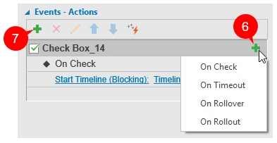
The following four events are available:
- On Check: Occur when the button is marked.
- On Timeout: Occur when users don’t respond within the specified time.
- On Rollover: Occur when the mouse enters the boundary of the check box/radio button.
- On Rollout: Occur when the mouse exits the boundary of the check box/radio button.
To add events to a check box/radio button, first select it in the Events – Actions section. Then click the Add Event button (6 or 7) and choose an event from the pop-up list. Next, add actions to the event and preview. For more details about events and actions, see Working with Events – Actions.
That’s it! Use interaction objects to create great interactive eLearning content. Visit the following links if you want to learn more about how to work with other types of interactive objects in ActivePresenter:
Working with Mouse Clicks
Working with Key Strokes
Working with Text Boxes
Working with Drop Area
Working with Buttons
Working with Animated Timer