Since version 2.5, Saola Animate has added some new features, including the introduction of the Effects tab. This tab contains sections for editing element’s shadow, filter and clip effects. And their appearances really contribute a huge effort to make the design visual more beautiful. In this tutorial, we will explore how do they work.
Drop Shadow
To begin with, most of our designs need to be created and used in two dimensions. Therefore, a solution that can help giving our 2D designs more realistic is adding elements of light and shadow into the design. From a design standpoint, drop shadow can make items or information stand out. For example, on this banner design, drop shadow helps make featured content more clickable:
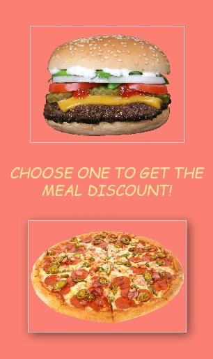
On the design above, a drop shadow is a visual effect consisting of a drawing element which looks like the shadow of a pizza frame. As a result, it gives the impression that the pizza picture is floating above the background surface. In order to create a shadow of any elements in Saola Animate, perform the following:
Step 1: Select a desired element.
Step 2: In the Properties pane > Effects tab > Shadow section > in Style combo box, choose Shadow to set the shadow.
Step 3: When Shadow is enabled, you can change the properties to customize the shadow. In this example, I have made the angle of 45 degrees between the shadow and the pizza picture in Saola Animate with another properties like this:
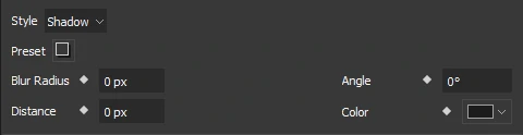
Click to read more about the shadow properties in Saola Animate:
Preset: Provide 8 presets with different angles to quickly change the shadow.
Blur Radius: Set the shadow blurry. The higher the value, the more blurred the shadow.
Angle: Angle between the shadow and the element. It’s measured clockwise, with x-axis as the reference.
Distance: Distance between the shadow and the element.
Color: Color of the shadow.
Above all, drop shadows are very common in design projects of all kinds, but also can be misused. A typical drop shadow faux pas is to make them too large, too dark, or too sharp. So, paying a bit more attention to the interplay of light and shadow in real life can give us some great inspiration for making our designs look more life-like.
Filter Section
When it comes to designing color, one of the most important elements helps to complete an effective visual design. Firstly, using color can gain interest and generate emotions. Further, color can create ideas or bring some kinds of messages. And color can also hold a special meaning, like, some studies underscored the fact that bright colors can express a positive mood. For instance, I chose the salmon color for the banner background because it is considered a signal of health and happiness. In addition, there is a fact that the warm hue also can stimulate energy and encourage actions. As regards the burger and pizza pictures, I used the filter effects in Saola Animate to get the better color of them. Since the original color of the burger was a bit pale, I have applied a yellow boost preset of filter effect to the burger picture, thereby making it fresher.
Moreover, I have used the filter, shadow effect and Auto-keyframe mode to make an animation express a chosen and unchosen meal, like this:
In this banner, I have changed the burger’s Saturate and added a bit Blur property when the mouse over the pizza. And of course, I have made a pizza pop up by shadow effect too. However, to apply filter effect to an element or a picture in Saola Animate, do the following:
Firstly, choose an element, then in the Properties pane > Effects tab > in the Filter section, change the properties as you want. When you change your mind and want to recover the original look of an element, just click Restore Defaults.
Click to explore how the filter section’s properties work:
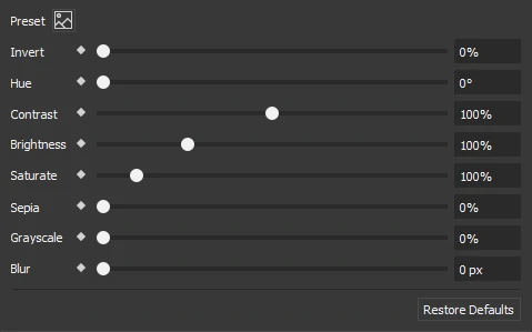
Preset: Provide 9 presets to quickly apply the filter effect.
Invert: Invert the sample in the input element. A value of 100% is completely inverted. And a value 0% leaves the input unchanged.
Hue: Apply a hue rotation on the element. Unit is degree. Hue rotation is amount of degrees around the color circle that the input samples will be adjusted. And a value of 0 degree leaves the input unchanged.
Contrast: Adjust the contrast of the input. By default, contrast value of an element is 100%. 0% is minimum value and the element is completely gray at this.
Brightness: Brightness is used to make the element more or less bright. And default value is 100%.
Saturate: Saturate the input element. Unit is percentage and 100% is the default value.
Sepia: Convert the input element to sepia, giving it a warmer appearance. The value of amount defines the proportion of the conversation. And a value of 100% is completely sepia. By default, sepia value is 0%.
Grayscale: Adjust grayscale of the input element. Default value is 0% and the value of 100% makes the input is completely gray.
Blur: Apply the Gaussian blur to the input element. The blur value shows how many pixels on the screen blend to each other, larger value will make the input more blur. And a value of 0px is the default.
Note: Filter effects for an element do not work in Canvas if the element, or a lower z-order element has been 3D transformed. Please preview in browsers, or export to HTML5 to see how filter effects are applied in this case.
Clip Section
Finally, the last one in the Effects tab is the clipping effect. Basically, this effect allows you to cut and hide part of your element. To be more precise, after applying and adjusting the clipping effect to an object, the part of the object that is inside the clipping shape will show up, while the one outside will disappear. Overall, there are 3 styles of clipping shape that available in Saola Animate: Rectangle, Circle and Oval.
Besides, you can do more with the clipping effect. For example, combining clipping effect with animation can create a transition effect. Specifically, when we apply that combination to the text, it will appear like this:

In order to apply the clipping effect to an element, follow steps:
Step 1: Select an element.
Step 2: In the Properties pane > Effects tab > Clip section > in the Style combo box, choose the shape you want to.
Step 3: After selecting a clipping shape style, adjust the properties and add a keyframe if needed.
For instance, if you want to make a text appear from left to right like the one above, you need to choose the Rectangle style. After that, set its Right property animate from 100% to 0%. Furthermore, there are many uses of the clipping effect as the entrance or exit transition that you can create.
Click for further understanding about properties in Clip section
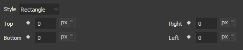
Top: Distance from the top edge of the element to the top edge of the clipping rectangle.
Right: Distance from the right edge of the element to the right edge of the clipping rectangle.
Bottom: Distance from the bottom edge of the element to the bottom edge of the clipping rectangle.
Left: Distance from the left edge of the element to the left edge of the clipping rectangle.
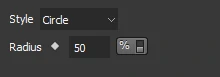
Radius: Radius of the clipping circle.
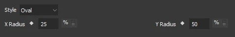
X Radius: Radius of the clipping ellipse along x-axis.
Y Radius: Radius of the clipping ellipse along y-axis.
Note: Circle and Oval clipping are not supported by Microsoft Internet Explorer and Microsoft Edge browsers.
To summarize, the Effects tab with its three sections may help designers as the best supports for designing their visual works. And that’s all about using the Effects tab in Saola Animate.