Saola Animate offers more than one approach to design for multiple screen sizes. Out of which, responsive layout is the best solution to the optimal viewing experience. Using responsive layout, you create multiple different layouts for a single document, thus letting it function well at any possible screen size. Think of responsive layout, for example, when you want to create a responsive navigation bar which is vertical on large screens and collapses to a hamburger menu on small screens.
This tutorial covers:
- Adding Breakpoints to Create Layouts
- Building Interactive Animations in the Base Layout
- Restyling Properties and Animations in Responsive Layouts
- Resizing the Viewport to Preview
How Can You Create Responsive Animation with Saola Animate?
The common workflow to create responsive animation with Saola Animate includes:
- Develop the design and decide the number of breakpoints/layouts
- Create a responsive project and define breakpoints/layouts
- Build interactive animations in the base layout
- Restyle properties and animations in responsive layouts
- Define export options and export your project
This tutorial focuses on the second and the fourth steps of the above workflow. It features a simple website responding to different screen sizes. The website has four layouts in total: Phone (below 600px), Tablet Portrait (between 600px and 900px), Tablet Landscape (between 900px and 1200px), and Desktop (above 1200px). You’ll use the desktop-first approach to designing the website. In other words, you’ll start from the largest layout and go down to smaller ones. As a side note, you need to prepare only an image to fill the entire page. All other elements are created within Saola Animate. You can download the project of this sample here.
Adding Breakpoints to Create Layouts
You can add and manage breakpoints when you create a new responsive document, or later in the editing phase. Be aware that you can change a non-responsive document to a responsive one if needed.
Adding Breakpoints When Creating New Projects
When you are creating a new responsive project, do the following:
Step 1: In the New Project dialog, click Preset Sizes and select 1920×1080 for the container size. (This is for the desktop-first approach.)
Step 2: Select the Responsive Layout check box. Then, click the Breakpoints button to add breakpoints. You can:
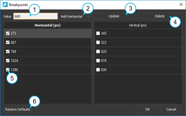
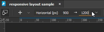
- Add new breakpoints: Enter a numeric value in the Value text box (1). Then, click Add Horizontal/Add Vertical (2) to add a new horizontal/vertical breakpoint, respectively.
- Adjust existing breakpoints: Select an existing breakpoint. Enter a new value in the Value text box (1) and click Update (3).
- Remove breakpoints: Select an unwanted breakpoint and click Delete (4).
- Exclude breakpoints: Apart from removing a breakpoint, you can choose to not include an unwanted breakpoint in the document. Just clear the check box (5) next to it.
- If you want to go back to the original settings, click Restore Defaults (6).
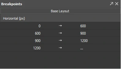
After filling up required information in the New Project dialog, click the OK button. You’ve done creating a new responsive project with specified breakpoints/layouts. In this example, the project has three horizontal breakpoints which define four layouts as in the figure below:
Adding Breakpoints Using the Responsive Toolbar
You can set breakpoints during the editing phase. This may happen when you initially create a non-responsive document but later want a responsive one. Or, you want to add more layouts to the document.
In the editor, do the following:
Step 1: In the Responsive toolbar, click Responsive (7) to switch to the responsive editing mode.
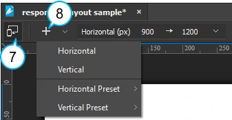
Step 2: Click Add Breakpoint (8) > Horizontal/Vertical (Preset) to add a horizontal/vertical breakpoint. The range that extends right or bottom from the breakpoint until the next one is automatically selected for editing.
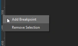
Besides, you can create breakpoints right on the Canvas rulers. In the responsive editing mode, right-click on the rulers where you want to set a breakpoint, then select Add Breakpoint.
Changing Breakpoints to Adjust Layouts
You may want to change a breakpoint to adjust the corresponding layout. In the responsive editing mode, click the breakpoint value in the Responsive toolbar, then scroll the mouse wheel or enter a new value. Alternatively, drag a breakpoint on the Canvas rulers to a new location.
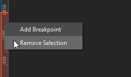
Removing Breakpoints to Delete Layouts
Sometimes, you create more layouts than you want and need to remove those unwanted layouts. In the responsive editing mode, right-click a range on the Canvas rulers > Remove Selection. This removes the selected range and the corresponding breakpoint/layout.
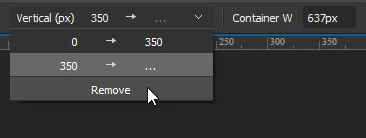
You can also click the Horizontal/Vertical Range drop-down list in the Responsive toolbar. Then, click Remove to remove the current range and the corresponding breakpoint/layout.
Building Interactive Animations in the Base Layout
At this point, you’ve done creating a new responsive project with specified breakpoints/layouts. Now, you’ll create animations and interactivity in the base layout. What you’re going to build in this base layout is for desktop screens (as you’re using the desktop-first approach). You’ll go down to smaller resolutions in the next part.
Take note of the following when working on the base layout:
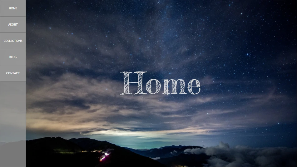
- Background image: Use Image Fill (Fill) to fill the entire scene with an image. The Fill option scales the image as large as possible without stretching it.
- The title: Set the width of the title to 100% width of the scene. Center the inline text and change the text indentation to 110px (which is equal to the width of the vertical navigation bar). That way, the title will always be in the horizontal center of the viewport while taking up the entire viewport width.
- Navigation bar: Set the height of the background of the navigation bar to 100% of height of the scene.
Restyling Properties and Animations in Responsive Layouts
After you’ve done creating element properties and animations in the base layout, you’ll make changes in each responsive layouts. This part will show you how to create and remove property and animation overrides. You’ll also learn to resize the viewport to preview responsive content.
Choosing a Layout to Edit
To switch between the base layout and the responsive editing mode, you can click the Responsive button in the Responsive toolbar. Or, in the Breakpoints pane, click the range/layout you want to select it to edit. Click the Base Layout button to back to the base layout.
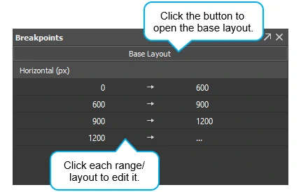
To switch between different responsive layouts, click the range/layout in the Breakpoints pane. You can also click the range/layout on the Canvas rulers or in the Horizontal/Vertical Range drop-down list in the Responsive toolbar.
Creating Property and Animation Overrides
You can restyle properties and animations in each responsive layout however you wish. In the responsive editing mode, when you make a change to a property/animation, it overrides the default set in the base layout. Overridden properties/animations are no longer inherited from the base layout. Overridden properties, animations, and the elements contain them are marked orange in the layout they appear. They are also marked in the base layout. This allows you to easily recognize overrides and remove them when needed.
Back to the today’s example, you need to make the following changes in each layout:
- Desktop (above 1200px): No overrides are required.
- Tablet Landscape (900px-1200px): Scale the title down so that it fits the new viewport width.
- Tablet portrait (600px-900px): Scale the title down and change the left navigation bar to a top one.
- Phone (below 600px): Scale the title down and change the left navigation bar to a top one using a hamburger menu.
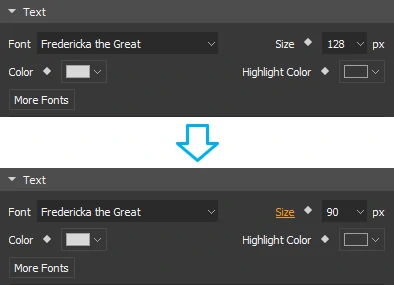
Let’s take a look at the Tablet Landscape layout. To override property in this layout, do the following:
Step 1: Enter the responsive editing mode. In the Breakpoints pane, click the 900->1200px layout.
Step 2: Select the Title element.
Step 3: In the Properties pane > Text section, change the text size from 128px to 90px. Immediately, the size property is highlighted to indicate that this property is no longer inherited from the base layout.
Removing Property and Animation Overrides
You can remove overrides to revert the element properties and animations back to the default in the base layout. Just click any highlighted property/animation/element > Remove Property/Animation Override. You can also remove all overrides from an element by right-clicking the element on the Canvas > Remove All Overrides.
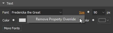
There are two cases:
- In the responsive editing mode: Removing overrides will revert the selected property/animation in that layout ONLY to the default in the base layout.
- In the base layout: Removing overrides will revert the selected property/animation in ALL layouts to the default in the base layout.
For example, suppose that you want to remove the text size override from the title. If you remove the override in the Tablet Landscape layout, the text size in this layout will revert to 128px. It’ll be inherited from the base layout from now on. Meanwhile, the text size in other layouts aren’t affected at all. On the other hand, if you remove the override in the base layout, the text size in all responsive layouts will revert to 128px.
Resizing the Viewport to Preview Responsive Content
Working with responsive layout, resizing the viewport lets you see how the output document will look across different container sizes. You can preview responsive content in browser or right within the program. To do the latter, in the responsive editing mode, click Adjust Container Size in the Responsive toolbar. The light gray control handles appear on the edges and corners of the container. Just drag the control handle to change the container size. You can also click anywhere on the Canvas rulers to snap the container to that pixel size.
That’s how Saola Animate allows you to build HTML5 animation with responsive layout. Stay tuned for the coming tutorial about flexible layout – another approach to responsive web design.